
The Challenge
AMD are one of the southwest’s most respected accounting practices. Over the years they have established a reputation for professional high standards of work, maintaining a culture of quality and value. They offer services which cover a gambit of accounting disciplines. Their brand was well known and had high awareness in its target market.
In 2015, the Executive felt it was time to refresh the brand, however they wished to maintain its continuity by minimising any changes to the iconic form and shape and add a corporate style which would reinvigorate the projection and add further motivation to the organisation and its personnel.
The Idea
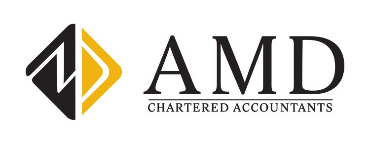
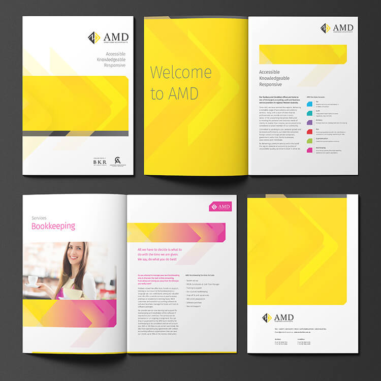
After observing and analysing the existing brand icon A.M.D, it was discovered that the leading (the space between each letter) was incorrectly distributed giving an uncomfortable relief to each letter. This had the effect of creating a visual imbalance and our first concern was to correct this. In working to refine the iconic typeface, we came to the conclusion that the corporate style lacked colour which created a blandness. This contributed to a lack of differential and it was decided to create watermark shapes using vibrant colours to distinguish various divisions of the company.
The Solution
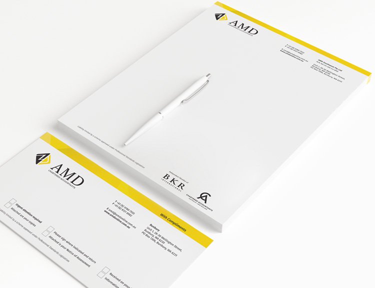
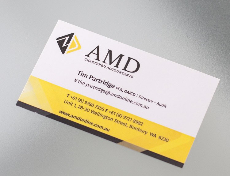
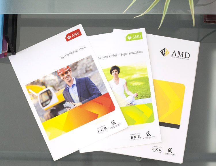
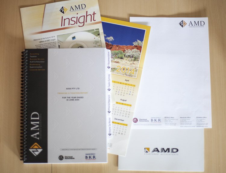
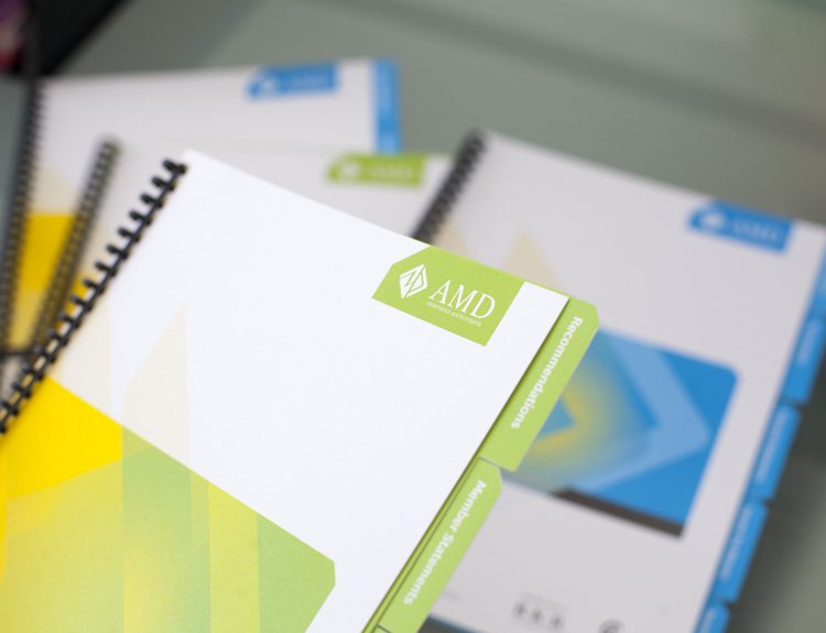
We refined the current logo to improve its legibility and balance. This also increased its clarity when working at a reduced size. It also allowed us to use certain elements of the logo as key graphics within the corporate styling.
The existing mustard colour was improved by making it a bright, fresh yellow. These print colours were selected to achieve more consistent and accurate colour tones across various stocks and print processes.
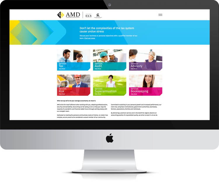
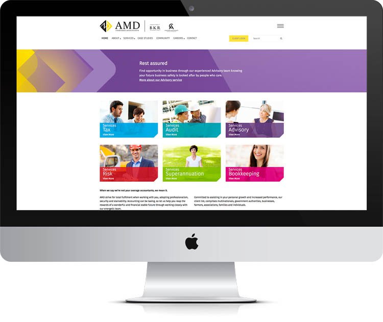
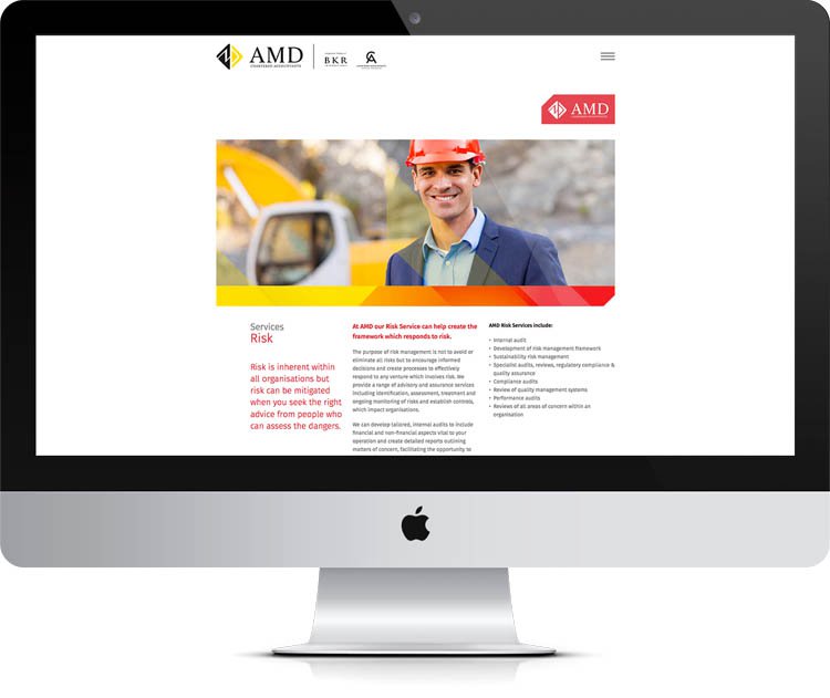
The arrow in the logo’s icon becomes the key graphic for the corporate styling, portraying AMD as forward thinking and proactive. Angles are used to reflect and integrate with the logo’s icons. A secondary colour palette was to be selected to add visual appeal and differentiate the service offerings.
The overall effect was to create a potent & dynamic organisation, forward thinking and professionally sound.
The Last Word
Accountants are always perceived as a ‘dry’ lot which, in this case is untrue. The personality and the versatility of the company’s values and voice is depicted in a simple application which sustained the existing image with a bright new face lift.
What We’ve Done
- Campaign Development
- Brand Development
- Corporate Style
- Stationery Suite
- Design
- Printing
- Merchandise
- Collateral
- Signage Solutions
- Animation
- Television
- Radio
- Press
- Digital & Social Media
- Media Planning & Buying
- Copywriting
- Website