
The Challenge
The City of Bunbury has very specific requirements and demands high quality workmanship. Over the years thebox has been responsible for a number of such design tasks.
These include:
- A series of 15 second television commercials for tourism to Bunbury at intra state levels.
- A brand identity for the City’s joint Waste Management Program.
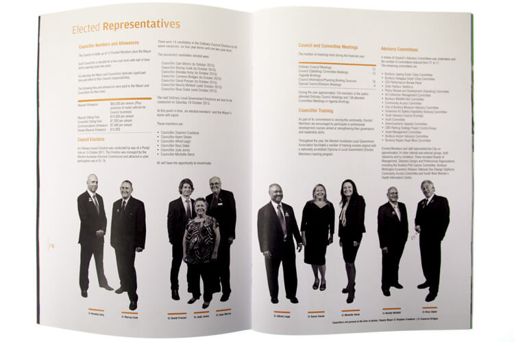
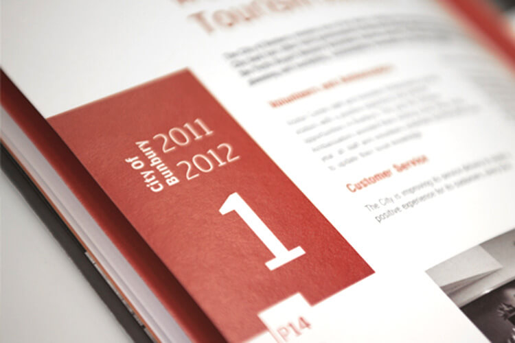
- The design and conceptualisation of the City’s 2012 Annual Report.
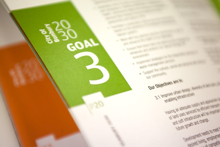
- The design and conceptualisation of the City’s 20/30 Strategic Plan.
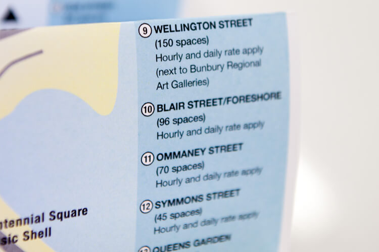
- The design and development of a Parking Plan Document (which included special colour coding for those who suffer colour vision impairment).
As with all Local Government jobs, the demand for excellent communication and positioning is of vital importance and thebox prides itself on being able to offer a service which matches the strict brief.
The Solutions
15 Second Television Commercials for Tourism
The initial brief called for an inexpensive series of 15 second commercials which portrayed Bunbury as a thriving city with the ability to provide all the amenities of a short or long stay visitation. The perceptions of Perth people relative to Bunbury had been surveyed and the finding indicated a view of Bunbury which was outdated and misleading.
The concept Jack in the box utilised was to showcase the various quality possibilities that a stay in Bunbury could offer. Featuring a range of venues that demonstrated a vibrant, modern city surrounded by quality attractions, the commercials were tagged based on changing the expectations – ‘More than you Expect’.
Jack in the box, scripted, filmed, edited and directed all five Television Commercials.
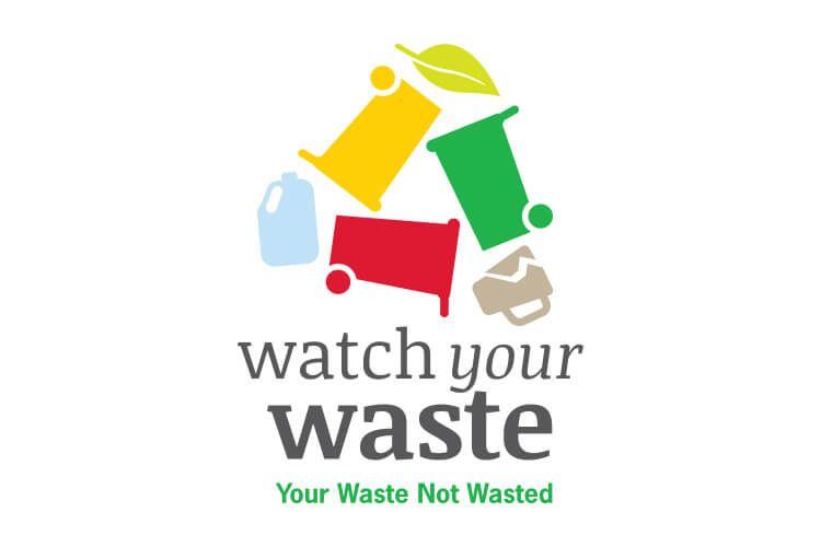
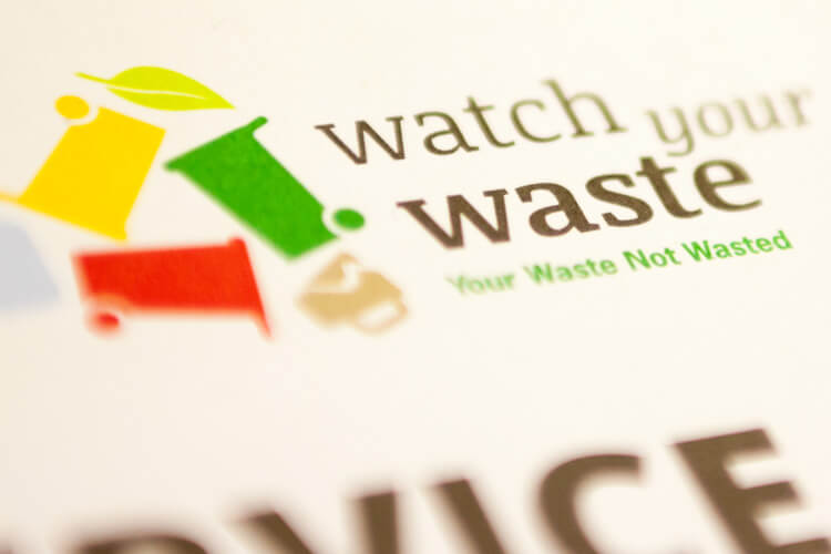
Brand Identity – Waste Management Program
This brief called for a brand identity which would represent the use of a three bin service for the collection of household refuse. Previously a two bin service had existed with general refuse (Green Bin) and recyclables (Yellow Bin) being separated by the householder. The new concept was based on the collection of organic waste in a newly introduced lime green bin which would be collected on a weekly basis. The traditional dark green bins would be adorned with a new red lid and collected on a fortnightly basis with all non-organic waste. A further request was to ensure the brand clearly depicted the actual function of the bins to help educate and create high memorability.
The concept thebox utilised is reflected in the brand’s rationale:
“The brand mark is a pictorial representation of the process for the new waste initiative. Clear icons are used to easily identify the three areas of waste in the scheme. The style is designed to become iconic in the way the ‘Do the right thing’ and recycle marks have become. The form of the logotype is round and flowing to portray an organic/environmental feel.
The shape evokes a sense of recycling (two of the three bins being environmentally positive). At the same time the shape has a fun, friendly and relaxed feel, qualities important in getting people on board, especially in educating children. The typeface treatment once again is designed in an engaging fun way, important in achieving an initiative that is seen as easy and positive for everyone in the community in which to participate and not a bureaucratic directive of local government.
The colour pallet utilises the strong colour of the bins as the dominant visual identifier. Less vibrant, more earthy colours are used as a supportive secondary pallet.”
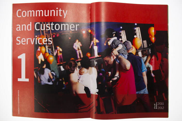
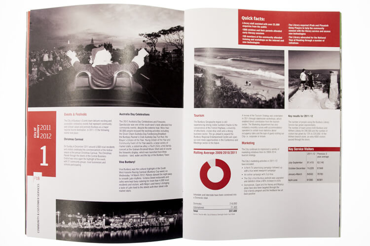
Design of the Bunbury City Annual Report 2012 & the City’s 20/30 Strategic Plan
As with most Annual Reports and Strategic Documents the challenge to make them interesting and prestigious is part of the designer’s major influences. In these briefs the requirements were no less problematic and thebox were asked to ensure both documents were graphically depicted to position the City as a modern, dynamic body, whose efforts could be fully appreciated.
Both concepts are best illustrated by the photography shown here. Sleek and modern pagination is accompanied by the use of etched photography and technical charts. Large photo collages with well designed typography are a feature of both publications and influenced the delivery of the content in both relevancy and interest.
The creation of documents such as these demand the talent and skill of an experienced designer and the eventual outcome is severely impacted by the crafting of the layout and typography.
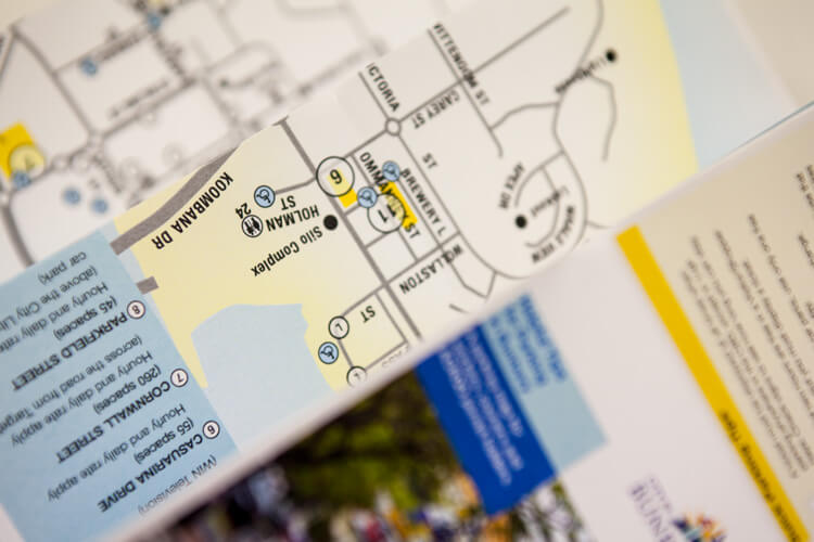
Design of Parking Plan (including colour coding for colour vision impairment)
The brief required us to communicate a new parking regime in the City of Bunbury, through an easy to read brochure which would assist residents and visitors to park without violation and to understand the timing associated with the spaces available. As a unique feature Jack in the box were asked to include the use of symbols and colour codes which would cater for those with colour impairments in their sight.
The final concept met all specifications and what resulted was a parking plan and a separate brochure for City workers. The guides were scientifically tuned to ensure the person with a colour impairment could interpret the map easily and for those whose sight is healthy, the completed document is easy on the eye as well as being practical and easy to understand.
What We’ve Done
- Campaign Development
- Facilitation
- Brand Development
- Design
- Printing
- Collateral
- Video Production
- Digital & Social Media
- Media Planning & Buying
- eNewsletter