
The Challenge
With a heritage in agriculture, Forest Grange saw an opportunity to introduce consumers to a new kind of beef unique to the region and available in limited supply throughout Australia. British White cattle are renowned as one of the world’s finest meats and the company’s intention was to grass feed and graze on organic, pesticide free pastures in the South West just outside Capel. They would bring to Australian tables the very finest tasting beef from their herd of British Whites.
Looking to develop the business through markets and online sales, the company wanted to look different but traditional. They required a well crafted and simply executed brand, which would add further distinction to the company, while positioning the product in its rightful place in the market – a high quality, gourmet meat, farm gate to table. The importance of a high quality brand in the initial start up of the business was a priority.
The Idea
To ensure the brand promoted its unique selling points, our concept was to develop a corporate style that reflected ‘how it used to be’. The traditions of butchering are almost ageless, however in the late 1930’s it surfaced as an artful practice driven by taste and new demands for hygiene. We consulted the past history and there we discovered a retro, traditional style which reflected a British/European flavour, harmonic with the antecedence of British White cattle.
The Solution
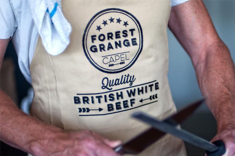
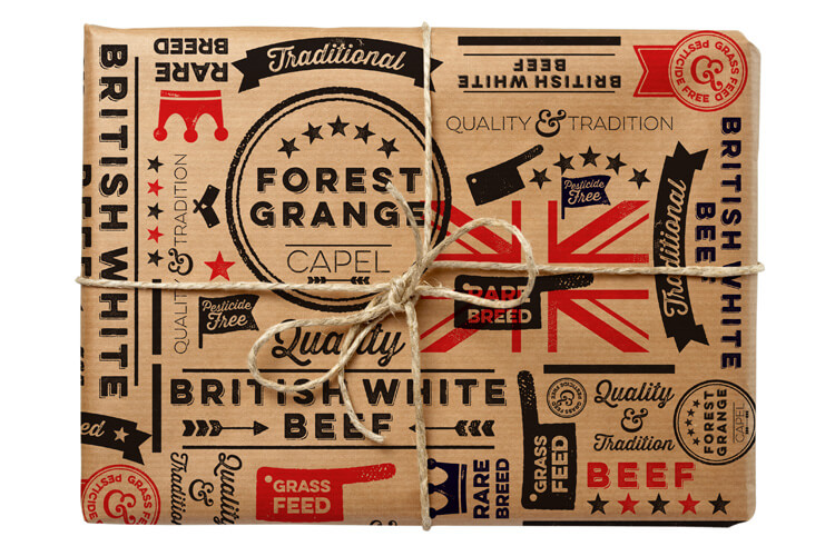
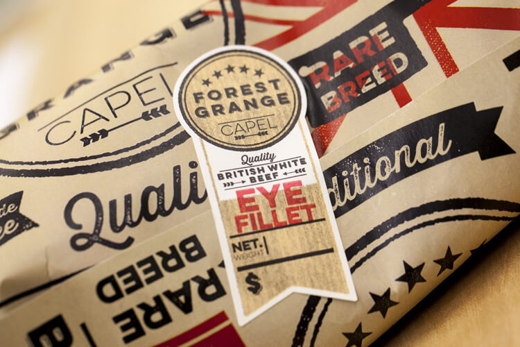
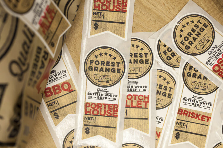
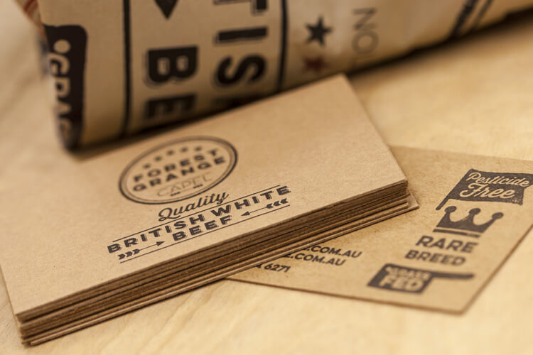
Understanding the packaging would be at the major retail point of sale, we developed a brand which was indicative of the 1940’s and 50’s .Utilising traditional styled, quintessentially English typography and harmonising with textures and organic materials of the era, we crafted a classical branding which reflected the essence of old fashioned quality service, accompanied by hand picked joints of meat; butcher to customer.
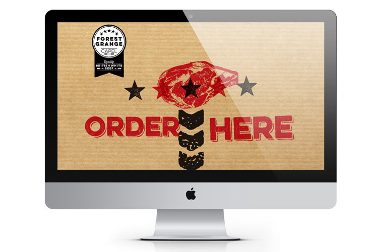
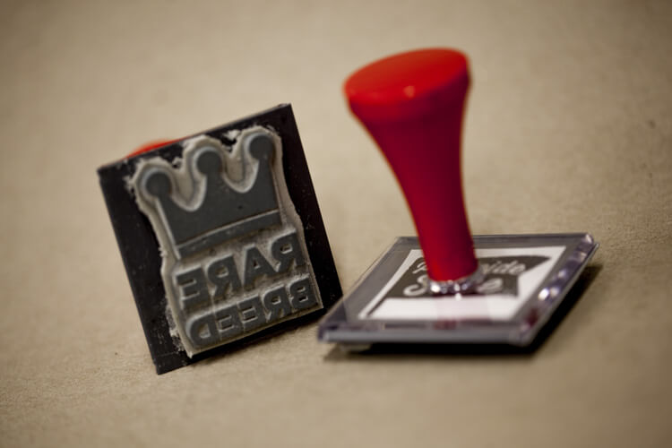
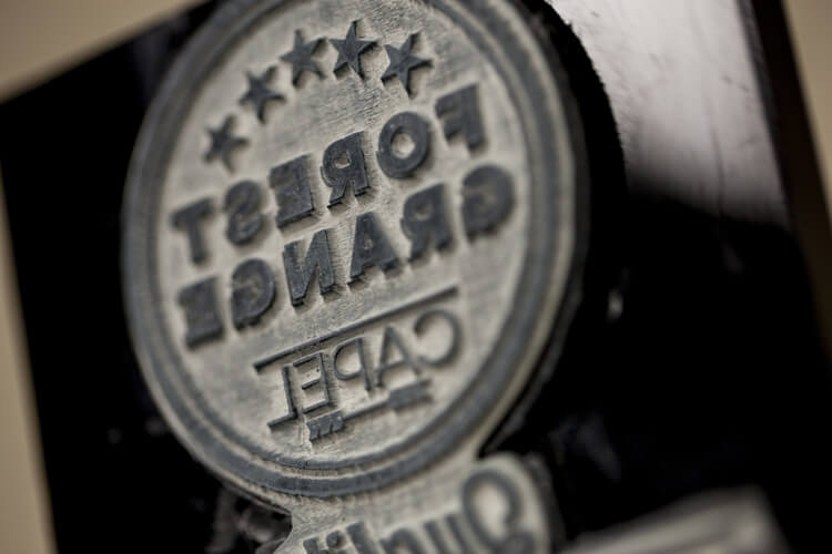
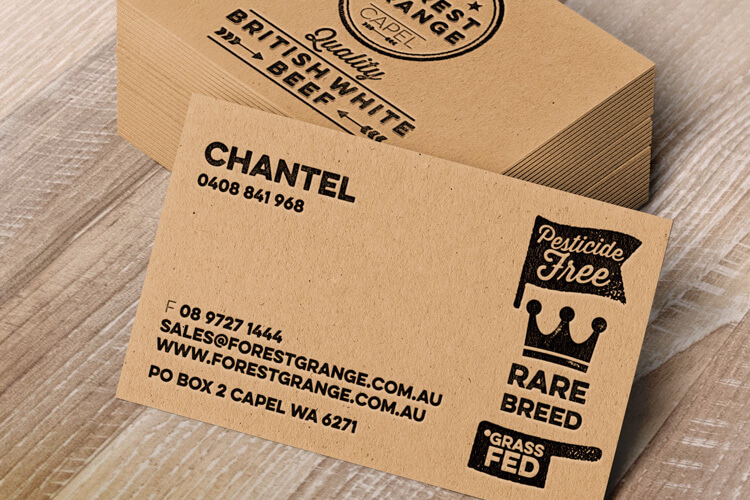
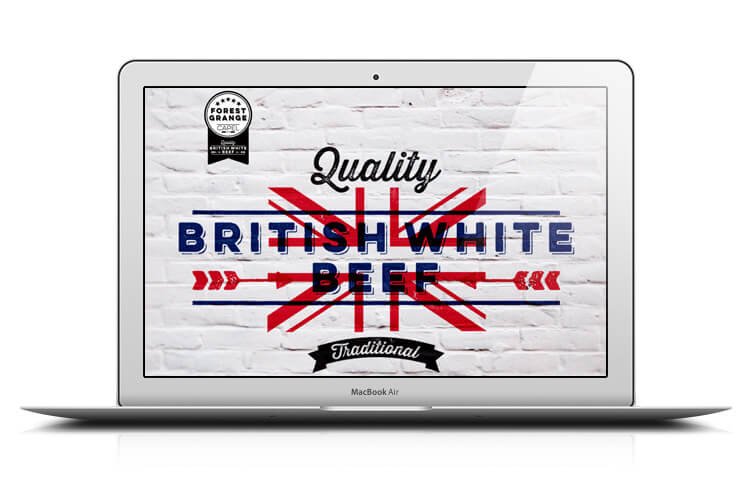
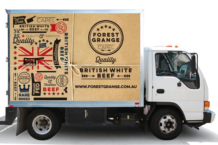
By the use of materials such as chopping blocks, brown paper and string, stressed paint work and rubber stamps, the team crafted a livery in a style reflective of an earlier era and subtly ‘British’. This was further applied to stationery, labelling, wrapping paper, meat boxes, market stall apparel and vehicle livery. Translated into a website, the brand demonstrates a discipline of continuity and reflects the quality of the product in all its forms.
The Last Word
Branding is an onerous proposition, because it demands a company and its products to be exemplified in all their projections. This case study is a perfect example of the mirroring of a high quality product supplied by a customer driven, highly reputable company, using an extraordinary brand identity to project its voice to the consumer.
What They Said
Just want to let the entire team know I am getting fantastic feedback on my branding. Everyone who sees it simply loves it. Thank you everyone – I certainly couldn’t have gotten this bus on the road without the encouragement and support of everyone at Jack in the box. This is just the beginning… bring on 2016!
Chantel Ferguson
Owner & Director
What We’ve Done
- Brand Development
- Corporate Style
- Design
- Printing
- Merchandise
- Collateral
- Packaging
- Signage Solutions
- Website