

The Challenge
Paul & Marina Carter commissioned the team at thebox to create a brand and positioning for a new retail venture within the horticultural industry. This included a nursery, soils & compost sales, garden supplies and commercial reticulation.
The requirement was to name, brand and develop a harmonic style which would stand apart in the market clutter and allow them to build upon their idea in the future.
The Idea
After researching the competitive nature of the industry thebox team searched for a name which would be easy to remember. The name ‘Foris’ was selected (a genitive Latin noun for ‘outdoors’.) In shaping the concept the team considered the consumer attitudes towards gardening and popularity of residential landscaping, especially within a booming housing market.
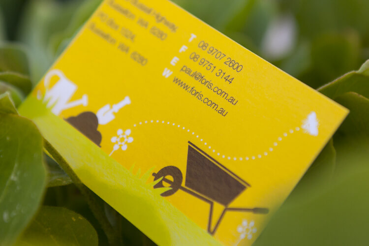
It is a well recognised fact that the beauty of plants and flora facilitates a pictorial splendour, which can be relied upon to attract attention visually, however most, if not all, use this marketing technique to drive their advertising. thebox always attempts to create work which differentiates clients and projects away from the pack. As a result we created an idea based on whimsical graphics using bees, worms, buckets, hoses, wheelbarrows etc., creating a corporate image which was conducive to the lightness of the world’s biggest hobby.
The Solution
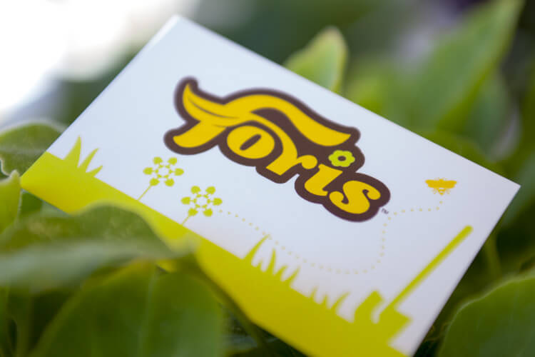
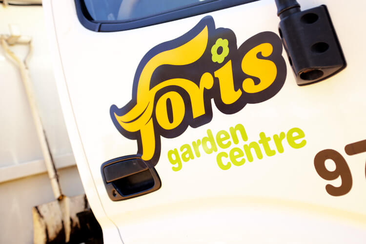
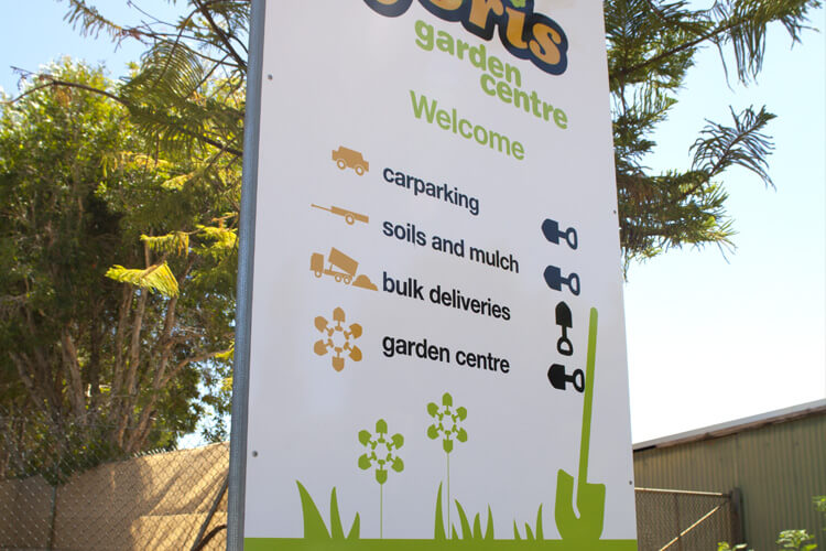
The design was developed to create a friendly & memorable icon. The icon is a customised logotype that reflects the nature of the business. This is achieved by the ‘sprouting r’, which creates the cross stroke of the ‘F’ and the flower being the dot on the ‘i’.
The form of the logotype is round and flowing to portray a natural organic feel, (as opposed to a hard edged all uppercase typeface for example). At the same time the shape has a fun, friendly and relaxed feel, qualities described as being important in the discovery.
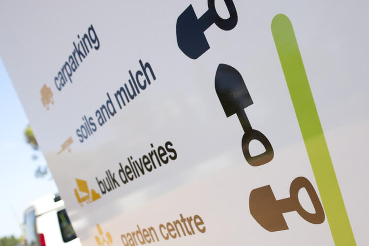
The corporate styling plays an important part in further portraying this relaxed feel of the business to the marketplace. Because the corporate style is flexible it can easily be adapted and utilised for specific purposes from packaging to signage to advertising and beyond. The colour pallet sets Foris apart from competitors, whilst portraying the organisation as friendly and relaxed, in the garden centre genre.
The Last Word
Today, Foris continues to work with us to market and manage the creation of advertising and media. Paul and Marina Carter are not afraid to think outside the box when it comes to promoting their business. The business is about to take an exciting second stage of growth and its increase in sales has been paramount in driving the company’s progress.
What We’ve Done
- Campaign Development
- Name Creation
- Brand Development
- Corporate Style
- Stationery Suite
- Design
- Printing
- Merchandise
- Collateral
- Signage Solutions
- Photography
- Animation
- Television
- Radio
- Press
- Media Planning & Buying
- eNewsletter
- Website
What They Said
“Aside from the exceptional level of professional and prompt service received by the team at Jack in the Box, we were over the moon with what your design team came up with for our branding. We have had numerous customers ask us if we are part of a franchise which was exactly the professional look & impression we wanted to achieve with our branding. Many thanks to Scott, Tony, Vaughan and team.”
Marina Carter, Proprietor