
The Challenge
Mental Health. It’s the political buzz word and there’s plenty of rhetoric. Pathways South West an active participant in helping as part of the remedy required a complete re brand and re projection to ensure the agency was able to be seen in a crowded NFP market, newly shaped by a very different government policy.
With programs that assist the mentally ill, Pathways has already helped hundreds of people whose lives have been disrupted by this deciduous and debilitating disease.
Our challenge was to create a brand which would suitably accepted by clients, health providers and government would accept and create memorability without creating offence.
The Idea
The idea was to create a new brand to better align with the organisation’s culture and its purpose. We wanted to create the organisation in the mind of the audience – a creation which would demonstrate hope and optimism, an imprimatur to make people feel comfortable and warm, a communication which offers those who suffer the pain of mental illness; a relief and an inclusion. The idea was to further to create a bright light in a sea of grey, while meeting the requirements of marketing’s disciplines.
The Solution
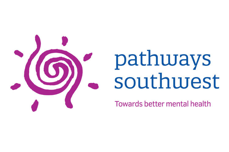
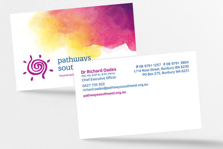
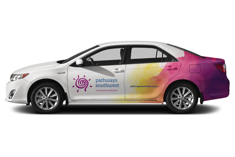
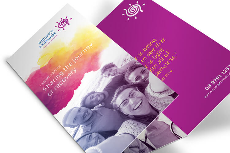
We created a logo which depicted an endless Pathway, circulating as a maze from the centre out to depict the journey through mental illness and the exit. We surrounded the logo with sun rays and underlined the emphasis with a corporate statement – Towards better Mental Health.
To support this pneumonic, we created a unique blend of fused colours using the corporate palette to develop a cloud effect. This is used to represent the darkness of depression and mental health. While the logo shows the positive the blended cloud depicts the negative.
Together they form a ‘ying & yang’ to send a subliminal message recognising the pain of mental illness and recommending the remedy. Unlike most brand logo’s this solution is based on using various components to deliver the complete message.
The Last Word
Mental illness is a serious problem in society today and Pathways is an organisation which is finding solutions. In the loud noise of rhetoric, the brand stands for action not words.
What We’ve Done
- Strategic Planning
- Brand Development
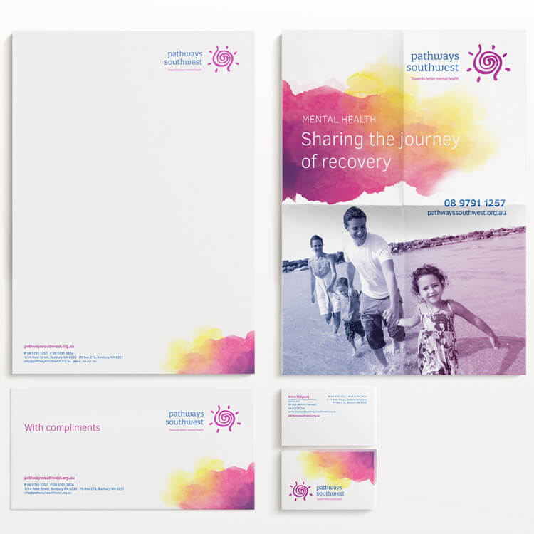
- Corporate Style
- Stationery Suite
- Design
- Printing
- Merchandise
- Collateral
- Signage Solutions
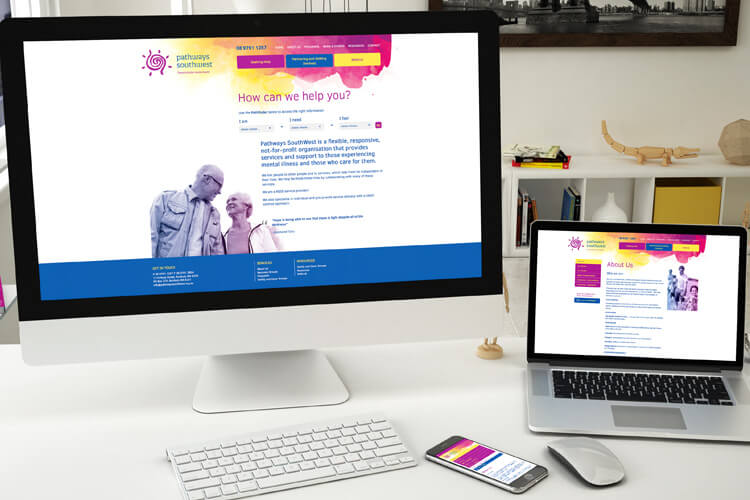
- Website