
The Challenge
GHS Holidays (previous business name) approached thebox with the goal of expanding their business, acquiring a more professional look and ultimately facilitating signing more owners for them to manage their holiday homes in the Gracetown area. The brand was outdated and the GHS Holidays (formally Gracetown Holiday Services) logo was inappropriate. In addition the use of the word Gracetown restricted the company’s ability to expand to other areas of the South West should there be a desire to grow. The owners recognised the desperate need for a rebrand in order to attract both clients and consumers using their services. The previous website that had been developed was slow, leading to potential customers abandoning the page.
The Idea
In creating a Strategic Plan, it became obvious that a number of ‘new thinking’ concepts were required to engage a ‘new start’. Our concept – to change the name to something lighter and fresher, something which consumers felt was associated with the joys of a holiday experience. Looking at the ‘joys’ of the area in which the company operated, one very specific common denominator stood out.
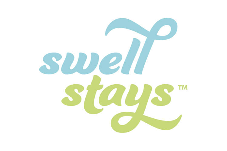
Sand and surf offered a theme representative of the area and it seemed logical that a theme of fresh, open air, and energetic activity be harnessed. A name was decided. ‘Swell Stays’ was to become a Gracetown icon.
The Solution
Changing the name of a company is no easy feat. Hours of brainstorming must examine the culture of the organisation, how they operate and how they are positioned and reflected in the public eye. Finally, after a potential name had been derived, thebox checked the availability of web domains, trademarks and ASIC requirement for name registration.
The company’s homes reflect a surf or casual beach, family lifestyle, however the name did not restrict the company to only managing homes in this area. Swell Stays could relate to anywhere in the Gracetown, Margaret River, Yallingup, Dunsborough regions or any coastal town.
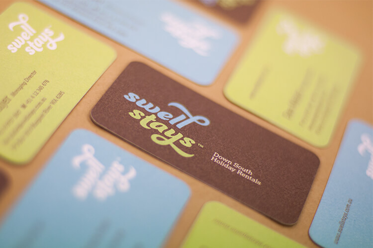
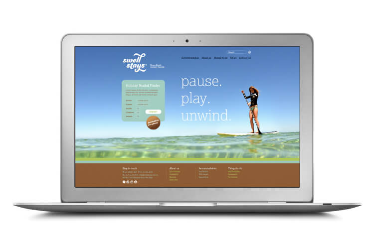
The new brand’s wordmark features sweeping typography reflecting the casual, relaxed nature of the brand. Soft blue, green and brown were selected for the colour palette, mirroring the natural beauty of the region with a stationery suite designed to include letterhead, business cards and email signature.
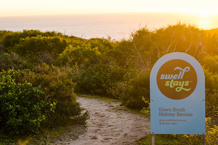
The paper selected for the printing was organic in its texture. Eye catching, colourful lawn signs were produced for propertes that Swell Stays manage. The website was redesigned to reflect the new brand and development tweaks now make the site easier to use, quicker and smooth to utilise. Finally, thebox created a professional iPad presentation filled with information and photos to show potential investment home owners the benefits of utilising Swell Stays as sound property managers.
The Last Word
Swell Stays have now increased the number of homes they manage. The company has been able to move from a cottage organisation to a more professionally projected organisation with a strong focus on service and the enjoyment of holidaying in the south west. Significant growth is now occurring to the credit of the owners who adopted the rebrand and strategy with open arms.
Disclaimer: While thebox did contribute to the Swell Stays website look and feel, thebox were not responsible for developing the platform of the site or the implementation of the booking systems.
The Award
thebox were awarded a Summit Creative 2015 International Award for the Swell Stays rebrand. The Summit Creative Awards recognise organisations internationally who excel in marketing initiatives.
What We’ve Done
- Strategic Planning
- Name Creation
- Brand Development
- Corporate Style
- Stationery Suite
- Collateral
- Signage Solutions
- Website