The Challenge
Selected from a panel of brand agencies and guided by a detailed and very specific brief, thebox was chosen to design a re-brand of the Vasse Primary School. Following selection, the team commenced an in depth discovery which met and canvassed the opinions of the board, parents, teachers and a select group of student leaders.
The results of these facilitations were channeled into a single brief, which called for the resolution of a number of complexities. The brand was to be redeveloped as part of the school’s change to an ‘independent public school’ status.
The Idea
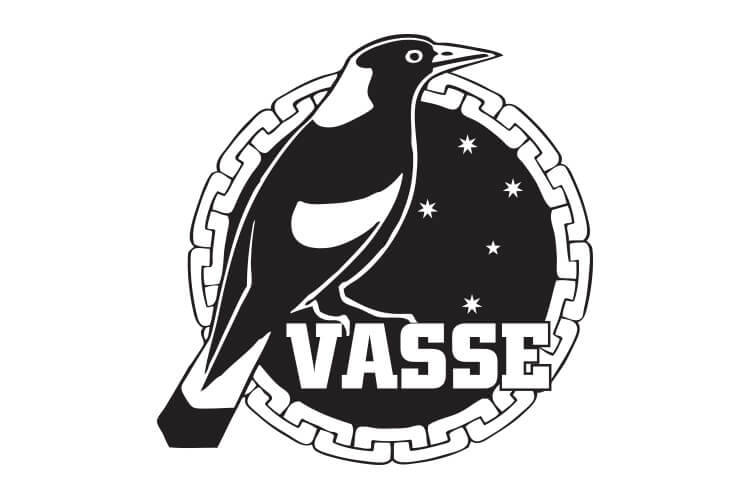
The existing brand featured a magpie, which appeared to have garnered the affectionate loyalty of every party interviewed. However, the existing magpie appeared as a static object and a chain which bordered the logo device was considered unsuitable and negative. The idea formed in the belief that the magpie should be set free. By creating animation and a token movement of flight, the symbolism would suggest activity and speed – the merits of a school full of youth and spirit. It was also believed that the wings could represent more than flight and thebox think tank began its journey of brand icon diversity.
The Solution
Consideration was given to the school colours and other important attributes such as the warmth of the community, the natural environment in which the school is situated, the sense of place with open spaces, giving rural appeal. The final driver was ‘a great sense of pride’ and this was a constant refrain present in every group discussion.
The brand was developed, meeting the demands of every one of the various complexities. Each aspect of the brand was carefully crafted and created to satisfy the brief. The final brand presentation came with a creative rationale, which most perfectly explains the brand.
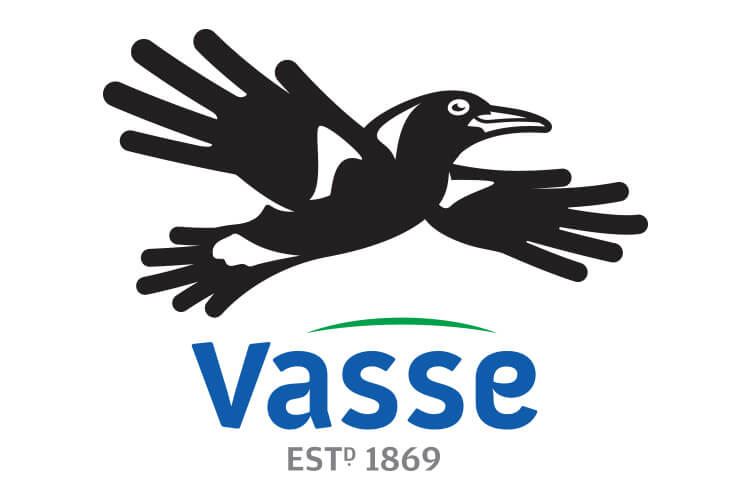
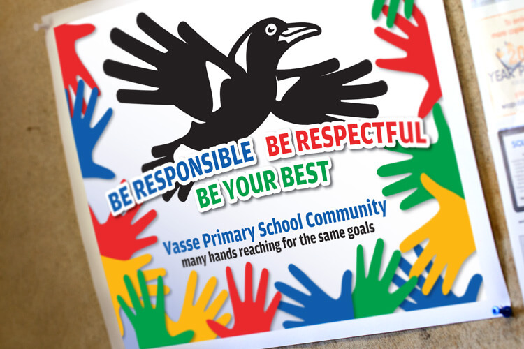
“The magpie was released from the captivity of the background and chain, to fly free and protectively above ‘Vasse’. The icon was created with personality and energy as opposed to being stationary and inactive. It now flies proudly with its chest extended, and the upward direction is progressive and speaks to a readiness for new challenges. Redrawn in a bold contemporary style, which represents the school as being modern, the magpie is now able to spread its wings and reach new heights, reflective of the school enabling each pupil to do the same through modern education and technology. The wings and tail have been carefully crafted from hands, representing the school community and the Vasse community as a whole. The hands provide an obvious connotation to embracing and connectiveness and this creative approach personifies the culture of both the school and the wider Vasse community along with its social nature. It possesses a friendly cheeky persona created visually via its face. thebox felt the supporting elements which honoured the past brand, offered great symbolism behind the concept of the chain. It was also felt that the chain, as a symbol, was not the most appropriate use of the metaphor and as such we looked to express this bond in a different fashion.
The hands used within the wing and tail structure of the magpie are symbolic of the union between all aspects of the school: Hands are a much more powerful representation of linkages, adding an integral human foundation to what has been typically a highly static representation. Holding another’s hand demonstrates compassion and care. We believe that these are two strong cultural components that standout within the school and the community.”
The Last Word
The new brand appears modern and retains a sense of history. It effectively positions the school as progressive while steeped in history; friendly, approachable and welcoming, yet strong and ready to develop an education for the next generation of students.
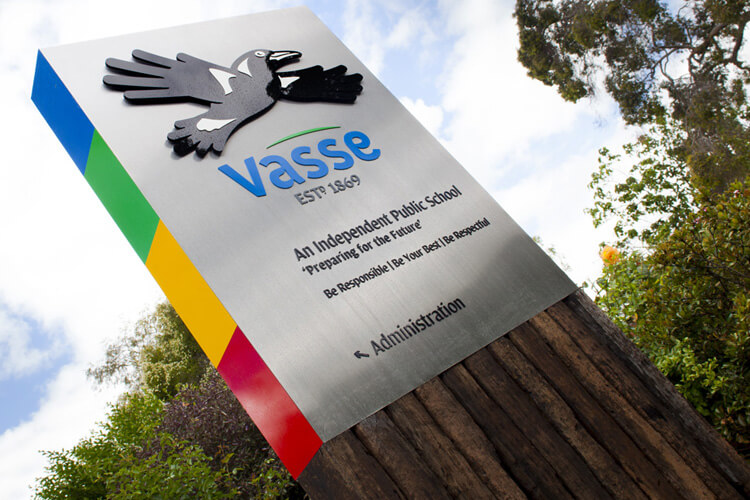
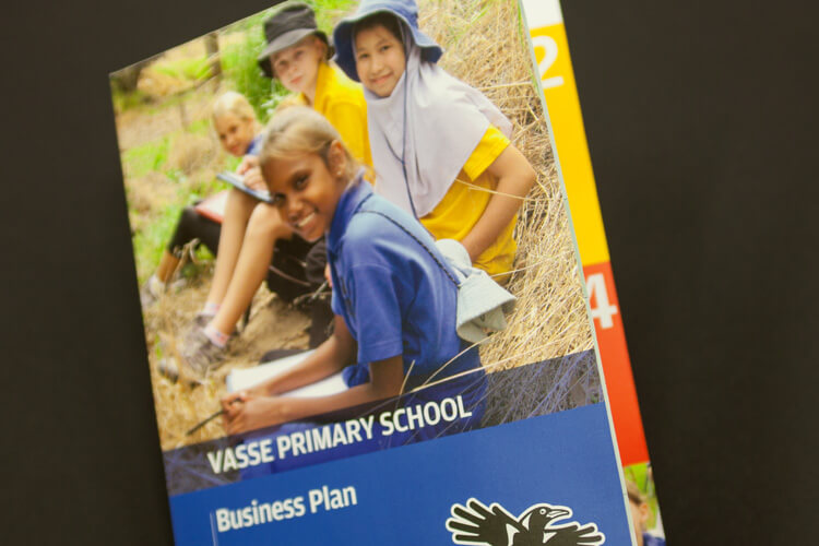
The Brand has been successfully executed throughout. The transition of school uniforms was staggered to facilitate a cost effective transition for parents and the important outward projection elements are now on full show. Students and teachers have embraced the new brand, especially the creative sentiments of the magpie and its representation. The sign, which now proudly pronounces the school’s culture, stands as a true representation of a community, a school and its environment. As the magpie proudly adorns the school’s pride of place, its purpose is now active and ever present within a growing and dynamic precinct.
What We’ve Done
- Brand Development
- Corporate Style
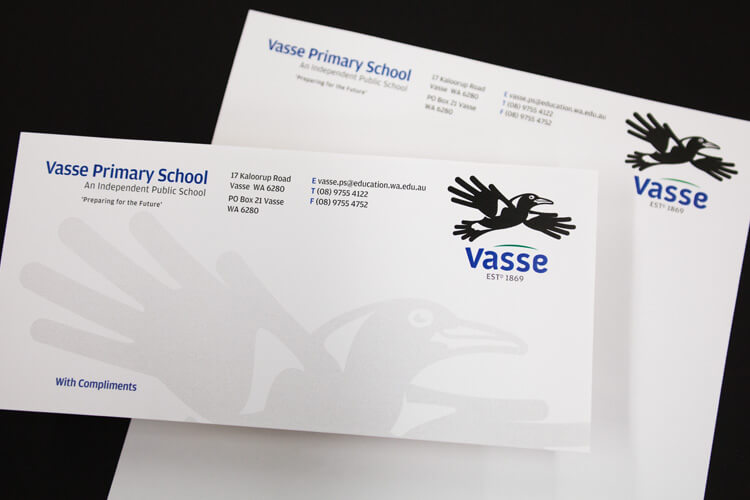
- Stationery Suite
- Collateral
- Templates
- Signage Solutions

