
Too shiny, too slick
Equals bland and the same
Fake boobs, spray on tans and steroid enhanced bodies are the only way to show yourself to the modern world. Unfortunately it appears this same stream of thought is pervading brands. These days it seems not only do we have to be unblemished and smooth in appearance but so do brands and I blame the internet and computer companies.
Windows, likes to make large desktop icons shiny and glossy with bevelled edges and drop shadows and it seems everyone suddenly wants their look to look like an Apple App icon! This is a trend that has been happening since the mid 90’s and is actually becoming passé. Why do clients and designers believe that because a brand is going onto the web, suddenly the brand icon and styling has to change to look ‘webish’.
Successful brands are designed to be consistent and only change in appearance for strategic or practical reasons. We design brands with alternative versions such as 1 colour versions because sometimes it isn’t practical to use a colour version for items such as faxing (do people still fax?) or newspaper advertising. Not because we want to use an alternative to the main brand mark on a fax, we can’t, but would if it would transmit clearly.
So why do we suddenly need a blobby alternative to view on screen when the screen can render a flat vector style image perfectly well? Just because it is on the internet, it doesn’t need to suddenly look blobby and shiny.
Worse still is, to now take the ‘webified’ version and use that as the main brand mark and styling.
Brands are created to meet a set of specific requirements and great brands are crafted using form and shape and artistic ability by a designer to achieve these brief requirements. Not by simply applying a bevelled edge and glass-like effect.
What a brand needs to do is keep the brand message regardless of what medium is being used to transmit the message.
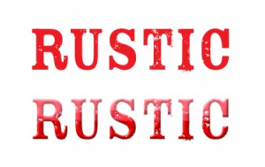
If your company is in the business of selling free range eggs and hand grown organic vegetables it would be foolish to apply all this shiny goodness to a brand. Your message would be better reflecting qualities associated with nature and the product, and if that means a rustic hand drawn look then leave it like that.
If however you want to sell your produce as being produced in a factory on a production line and tasting like plastic, then by all means make it look glossy and polished.
As with all design styles, there are times when a glossy web look is appropriate for the brand and its market.
However, if we apply ‘app effects’ to all our brands then all that will be achieved is that they will all look like clones of each other and will not stand out in the marketplace.

Vaughan Ransley
Brand Architect
Found this interesting?
Take a look at more articles about:
Or check out more articles by:
Vaughan Ransley