
Influencing with colour
Colour in packaging and branding
Colour is an important and powerful mechanism, especially when it comes to packaging and branding. It can influence a consumer to buy one product over another or to spend more money on what is essentially the same item. Designers use colour, and colour combinations, to create a personality for a product or brand and affect your perception of it’s value.
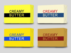
Take butter for example. It is a generic product that doesn’t vary a great deal in ingredients or quality. However through the colour combinations used on the packaging a designer can sway your opinion of what it is worth. Take a look at the examples below and think about which one you would be willing to pay the most for. Which one do you think would be the cheapest?

Chances are you believed the black and yellow one to be the cheapest and the burgundy and brown to be the most expensive. The values we associate with colours are learned as we develop and are intrinsically associated with our culture. In western society yellow and black are associated with generic packaging and therefore we believe they should be cheaper. Red represents value hence the fact a large majority of fast food outlets use it in their branding and packaging. Blue has mostly positive associations and is often used by corporate business to create trust.
Colour is also used to express personality and stimulate brand association. Think Coca-Cola, T2 or Cadbury. These three brands all ‘own’ their distinct colours. In the chocolate aisle of a supermarket it is easy to pick out which bars are Cadbury purely by the purple colour. Similarly in the fridge Coke’s red stands out before you even read the label and T2 own orange in the loose-leaf tea market. These companies have realised the power of colour and by using it so consistently have been able to ‘own’ these colours in these categories. The value these companies place on ‘their’ colour was highlighted in 2003 when Cadbury attempted to sue rival company Darrell Lea who were using a similar shade of purple in their product packaging and marketing.
The colours used by these companies is also not random. They are carefully chosen to convey a certain message to the consumer. Orange, for example, is said to increase the craving for food and it is also a healing colour – very fitting for flavoured teas. Red represents value for money and is a top
pick of males. It is also visually dominating hence Coke advertising
demands attention.
Colour is integral to any brand and it’s product packaging. In combination with type faces, finishing techniques and imagery it can really affect the value we place on an item. Clever companies don’t choose their favourite colours when creating a new brand or developing packaging, they research what colours represents and how colour combinations are likely to be perceived by their target market.