
The Challenge
Of all brand designs to attempt, Architecture would arguably be the most onerous. Winston Churchill once said, “We shape our buildings; thereafter they shape us.” In many ways this applies to the designing of a brand. It too shapes a company while depicting its personality and creating a company in the mind of consumers.
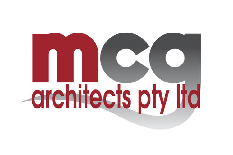
MCG are regional architects, whose designs are changing the face of regional Western Australia. When they approached us to create a new brand we knew it was more than a mere title for a company, more than a name. It was a commission to shape an organisation and portray them for what they were and what they did. It had to be beautiful, stylish and different, it had to reflect their appetite for structural style and importantly it had to make a statement about a visual art which makes buildings speak for themselves. We asked ourselves, “How can we satisfy such demands to men and women whose visual perceptions are so finely tuned to our own?”
The Idea
Our ideas were shaped and fashioned by the company’s very work. They were adventurous and creatively expansive. They dispatched formality and while function was maintained they sought to drive a freshness in the midst of traditionalism. They were different without being obvious. A certain ambiguity transcended their work and it was this spark that lit the way for our design team.
We wanted to replicate their modus operandi and create a brand which was never obvious; a brand that required people to think, and like their design structure, offer a sense of craftsmanship which flowed with their business as easily as their buildings flowed with the environment.
We fell upon the idea of the obvious, to use the very profiles that guided their creativity – shape!
The Solution
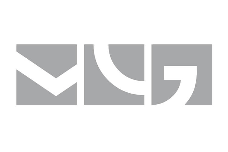
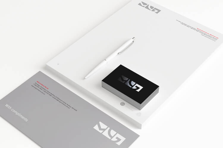
The Brand is formed by a series of shapes derived from each of the company’s initials – M.C.G. However instead of the usual form and letter shape to signify how we too could move away from the usual, we took only segments of the shape to create a beautifully formed rectangle. We utilised the ‘V’ shape from the centre of the ‘M’ skewing its size to the left slightly to allow the eye to move to the arc only of the ‘C’ and taking the most interesting part of the ‘G’ – its tail – allowing the form to demonstrate the completion, as a brake to say, “No more!” Using the company’s colours of red, black and silver we created signage and livery, which used ‘concrete’ materials to demonstrate the organic nature of the MCG style.
The Last Word
The result is a most beautiful word brand, sleek, interesting and harmonic with an organisation, which is happy to introduce the country to modernity in architecture. It sits unembarrassed by national and international brands and is a true revelation of the company’s philosophy.
We are proud to have met the challenge and created a structure which truly reflects a company whose innovative values are bringing new and vibrant standards of architecture to the South West.
The Award
thebox were awarded a SILVER Summit Creative 2016 International Award for the MCG Architects rebrand. The Summit Creative Awards recognise organisations internationally who excel in marketing initiatives.
What We’ve Done
- Brand Development
- Corporate Style
- Stationery Suite
- Design
- Printing
- Collateral
- Templates
- Signage Solutions
- Photography
- Copywriting
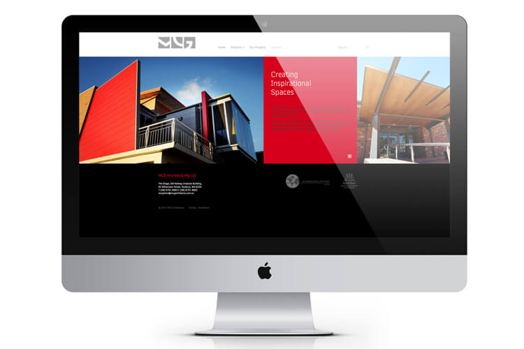
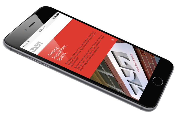
- Website