
The Challenge
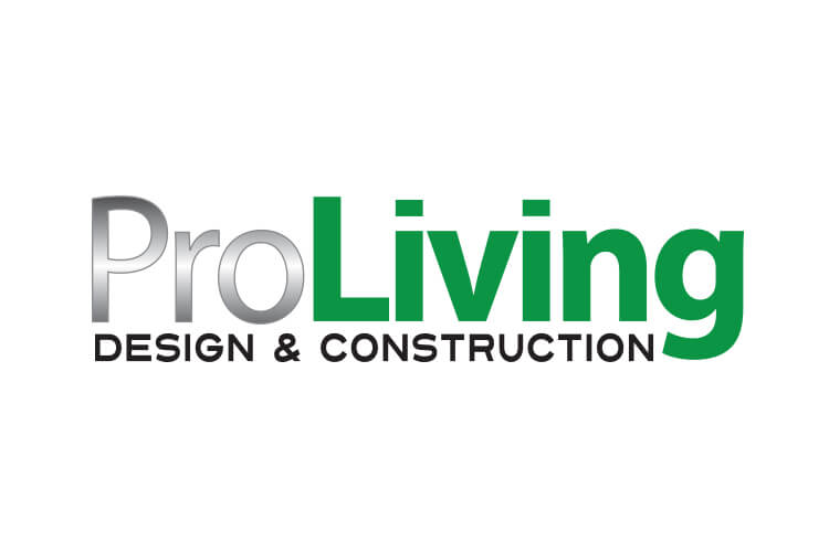
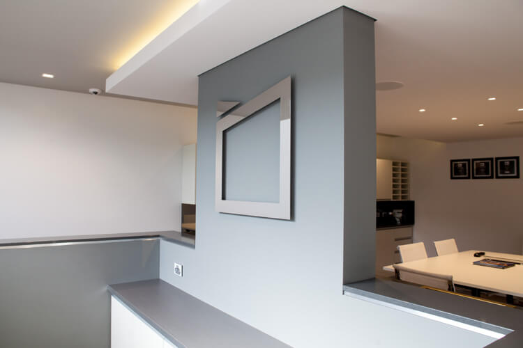
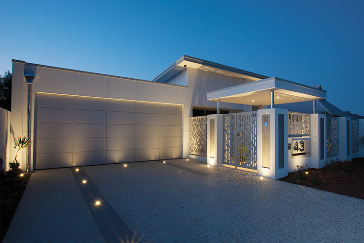
ProLiving were in need of a brand evolution. They wanted to move away from their somewhat tired brand, to an image which better reflected their position in the market today, something which would offer them longevity. The company’s building styles can be described as cubic or ‘blocky’, featuring modern living spaces and offering a highly prestige look. In terms of design, thebox reasoned that the brand needed to reflect this strength while remaining aesthetically pleasing.
The Idea
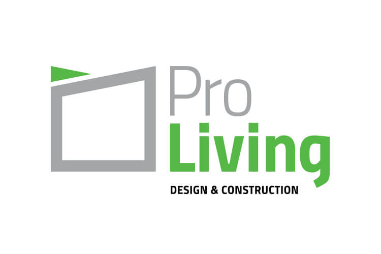
Limited by a tight brief we wanted to reposition the organisation toward a high end market. Energised by the edgy and very line driven nature of the architectural design, we eventually settled on a formulation based on sharp square and highly angular visuals which represented the modernistic style of the organisation’s final buildings.
The Solution
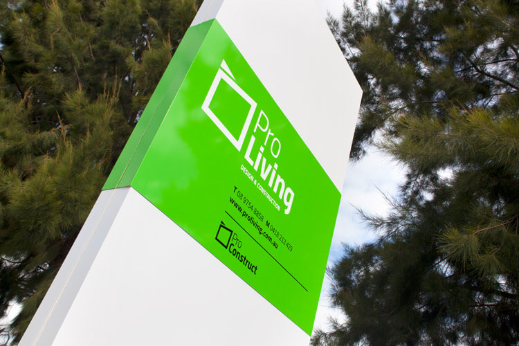
The four key foundations on which thebox focused were: Dynamism, Modernity, Strength and Innovation. thebox took the current brand colours and moved away from the dated stainless steel look typeface to utilise a matte silver. Once applied, the silver could be foiled if the collateral required and was of an up-market or elegant nature. The ‘ forest green’ was changed from a dull and reactive shade to a fresh, crisp green with more pop and energy. The typography was also altered to a contemporary and open-faced type that offered clarity and was more legible and eye pleasing.
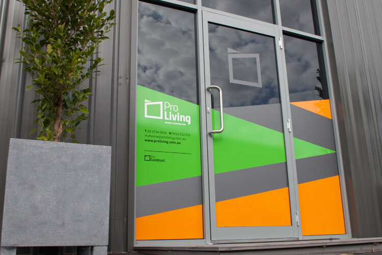
The brand was created to be attractive to consumers, fresh and memorable and the use of white space facilitates ease on the eye. Business cards were designed using the new brand with a corporate style to reflect the brand philosophy. A car decal was designed to add frequency to brand awareness while they were on the road, along with uniforms in the new colourways to reinforce the company’s professionalism and dedication to the brand, taking on the concept that if you live your brand, you believe it.
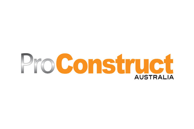
As a further addition, thebox were also asked to look at the company’s other brand ‘Pro Construct’. Styled the same way to work in harmony with Pro Living, the original orange was updated to a balanced tone to complement the new green.
The Last Word
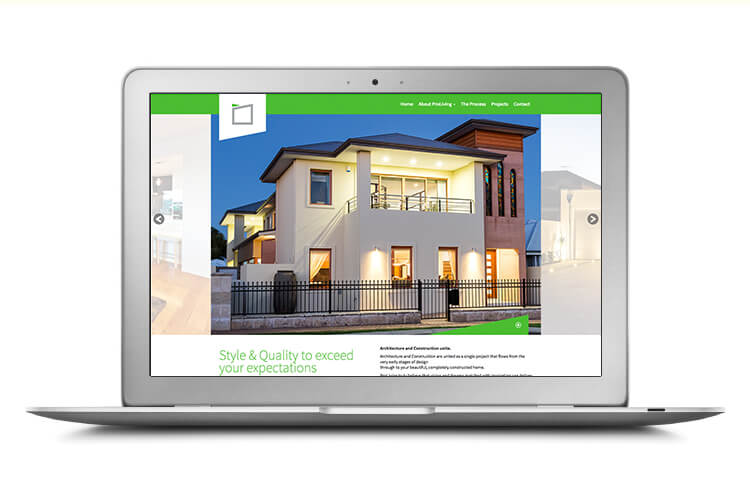
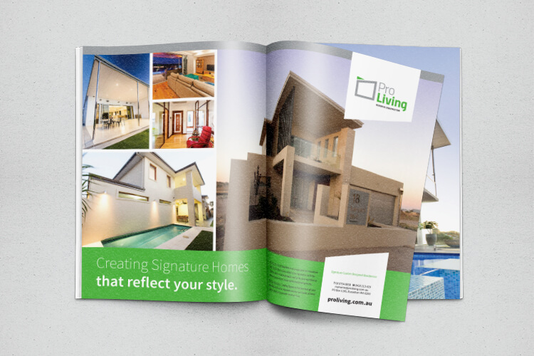
thebox have created a website and a magazine advertisement with the new Pro Living branding. This way the two areas of the business now flow together giving a contemporary look and feel that has raised the profile of the company and correctly positioned them where they are today.
What We’ve Done
- Brand Development
- Corporate Style
- Stationery Suite
- Design
- Printing
- Collateral
- Signage Solutions
- Press
- Digital & Social Media
- Copywriting
- Website