
The dreaded T word
What can go wrong with templates
Client: “We’d like you to make us a template so we can do the work inhouse”. It’s enough to make any designer shudder. Designing templates opens your well designed work up to unintentional sabotage. There are many reasons why templates can be disastrous, here are a few.
Firstly, when designers create their work, say for a flyer, they use professional design programs. These programs give them ultimate flexibility to position images, text, headlines and illustrations in a way that looks good and works. They can also output the work in a format that printers and external suppliers can use to reproduce exactly what the designer had imagined. Generally when designers are asked to create templates for a client they are for use in programs such as Microsoft Word or Publisher etc. These programs, whilst great for desktop publishing, are not so good for professional design work. As well as been clunky to work with they have many restrictions which can make performing a simple task quite cumbersome. They also work in the RGB colour space, which is fine for on screen applications or your ink-jet printer but not for your local print house.
Designers use their years of experience to create artwork that not only looks good, but communicates clearly. They can instinctively put a piece of artwork together where every element balances against the others and make it look effortless. Their eye for detail also means that everything lines up, the size of text is legible and that flaws such as rivers in text or incorrect resolution of images do not occur. For a non-designer this can be a real challenge. Designing is not second nature to them which generally means that small errors occur and poor layouts are created for inhouse materials which eventually dilute the brand.
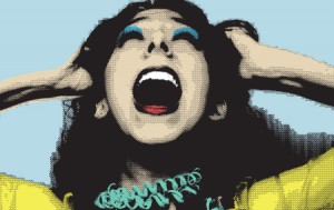
Another big reason why templates can be disastrous is the misuse of fonts. When a good designer creates a brand they accompany it with one or more supporting typefaces. Often these are fonts that their agency has purchased for their font library and due to licensing restrictions they can not give them away to clients. If the person using the template does not purchase this font for themselves then they will inevitably choose an alternative, or use whatever the programme they are using has defaulted too. Designers choose fonts for their personality. Some fonts are friendly, some shout at you and others are very neutral. By using a poor font substitution the message can be delivered in a very different way.
Just like fonts, the type of imagery the designer uses helps to communicate the brand to the consumer. Designers carefully choose images based on lighting and style that work together, and crop them to suit the layout. They will often edit images using effects such as duotone or colour overlays. Unfortunately many Microsoft programs cannot replicate these effects and often cannot do something as simple as crop an image, which means the work you create with your template starts to look very different to the original brand.
Templates however can have their place. If the template is for a simple applications such as a Word letterhead for online use, a PowerPoint presentation, Basic Newsletters etc. go for it! They can be invaluable tools for a business, particularly when used by someone who is an ace with the software. If there is no one in your organisation that can competently use the programme, if it’s for something more complex like a brochure or it needs to be professionally printed then maybe you should re-think the template.