


The Challenge
Requested to create brand for a new venture, Australian Farm Albums, thebox were given a clean sheet of paper on which to design the imprimaturs – a designer’s dream. After some research and consultation, it was decided the positioning of the organisation was to be that of a premium product and the brand needed to reflect this. The ultimate goal was to encourage more farming families and corporate farming entities to be part of creating an album focused on them.
The Idea
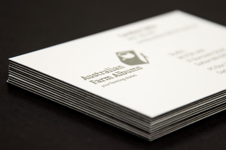
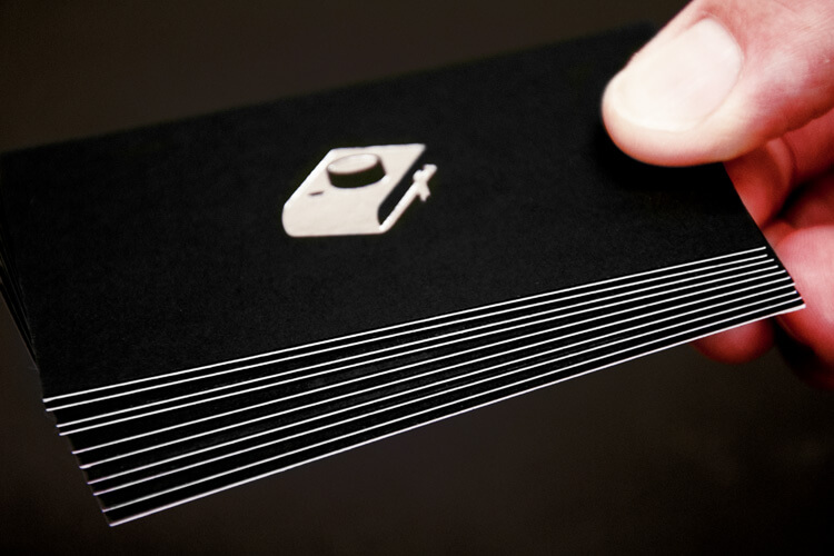
Moving away from the usual banal branding that can be found in many farming products, thebox looked to brand the organisation offering something sleek and contemporary. The quality of the photography spoke for itself, so icons of a camera and an album were selected to make a simple single icon which was recognisable in order to focus directly on the organisation’s core function.
The Solution
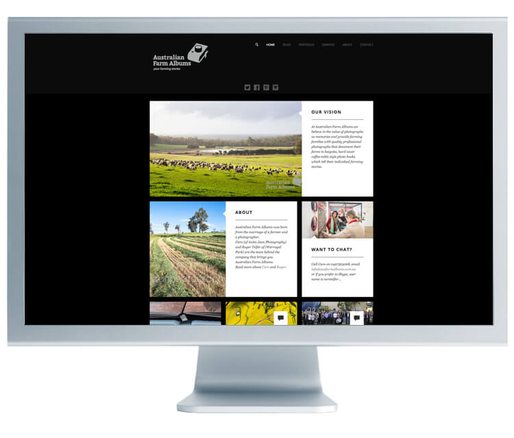
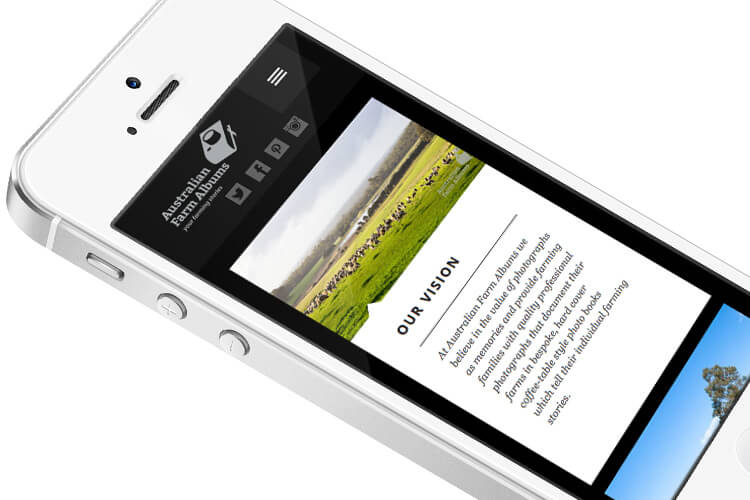
A simple colour palette of silver, black and white reinforced the photography element. We were cognisant that this was to be an attractive brand that could work globally, attracting both individuals and large corporations. The use of silver foiling was used to reinforce the premium product and the icon could easily be embossed or watermarked for simplicity and optimum style. A duplex business card was created projecting an air of prestige, while making them hard to dismiss. The balance of the stationery remained simple in its projection and classic in nature.
The Last Word
The total effect resulted in a highly-positioned, attractive brand that appealed to both individual consumers and large organisations across the global stage. The prestige created by the collateral, evokes sentimental feelings, with the classic camera and album icon used to illustrate the importance of recording a family and farming lifestyle.
What We’ve Done
- Brand Development
- Stationery Suite
- Printing