
The Challenge
Cornerstone Christian College has operated for many years without a genuine brand mark which identified their perceived positioning. Understanding this was a sensitive issue for the school community – particularly teachers, students and the school board – thebox commenced the journey of branding, demonstrating the need to discover relevant and necessary information to develop a brand that projected the personality and positioning of the school.
Work shopping commenced with facilitation and community consultation which would ensure the final brand was fully accepted, owned and close to people’s hearts, particularly with the addition of a new campus at Dunsborough.
The Idea
Over several days, thebox visited Cornerstone as part of an in-depth discovery process. An afternoon was spent exclusively with the senior students discovering what they admired about their school and the key points they felt would encourage new students to want to be part of a tightly-knit school community.
Consultation with teachers followed. The thebox team ensured they covered multiple areas focused on how teachers felt they were perceived by the greater community, how they wished to be perceived and the representations that differentiated their involvement from other schools within the same geographic area.
The result was a dynamic brand that encompassed caring and progressive education, academic excellence and guided by Christian values. The key brand drivers became growth and nature, geographic relevance, academic and community values, acceptance, support and spirituality.
The Solution
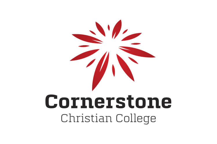
The Cornerstone Christian College brand icon is represented as a compass, as a metaphor for guidance and education. The north points top right to suggest upward movement and the south point is angled towards Australia’s South West. Gum leaves are represented in the form of the compass points for growth and development. The icon as a whole subtly reflects a cross as part of the Christian philosophy and is a construct of elements reflecting the diversity of the community and outward reach. The colour palette has been selected to ‘radiate’.
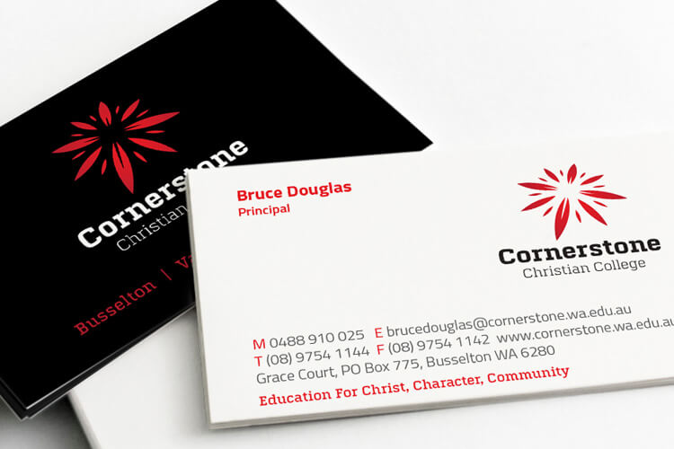
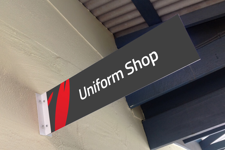
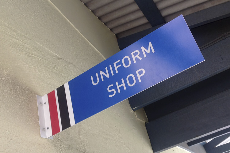
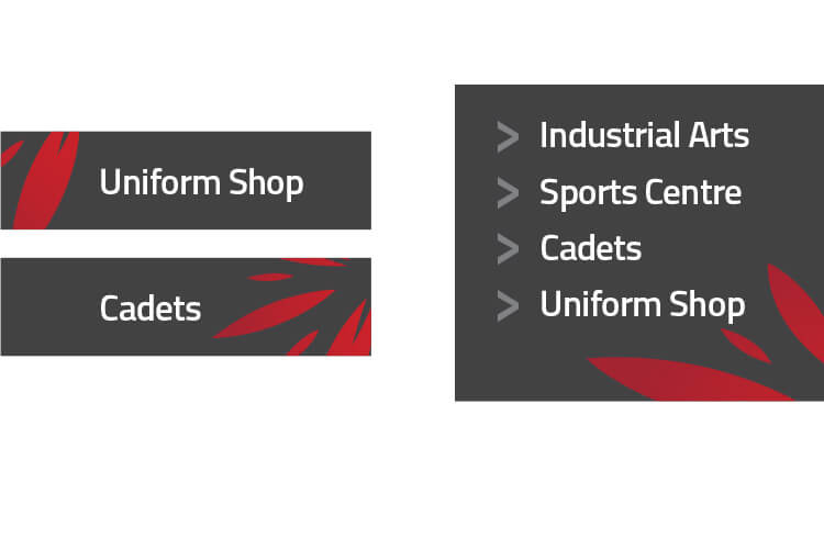
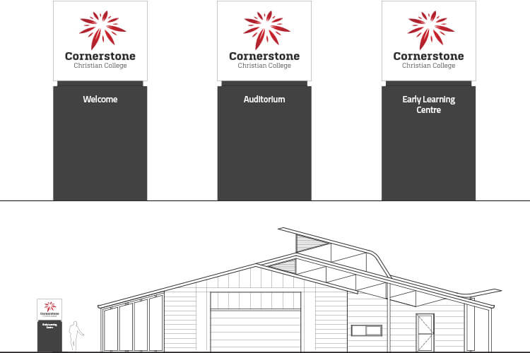
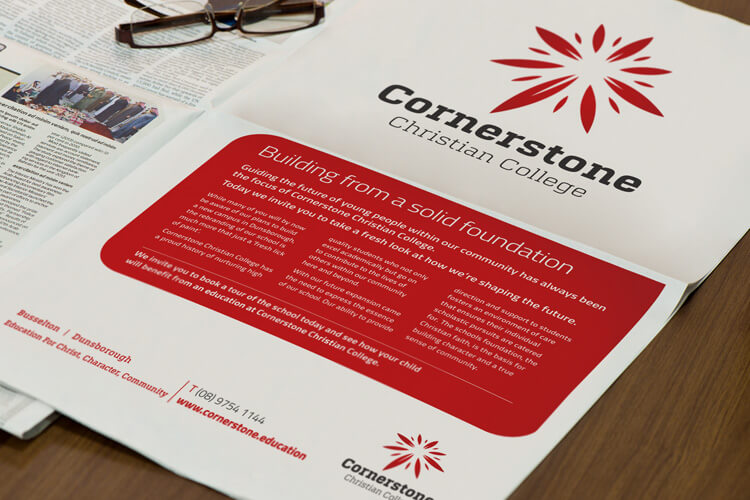
Livery items such as stationery, uniforms and signage were developed in Cornerstone’s new style using the powerful brand mark in addition to several press advertisements.
The Last Word
Cornerstone’s Dunsborough Campus is currently being completed with the continued vision of guiding young people and working with them to build a wonderful sense of character. The brand has been well accepted as a true and accurate representation of the school’s philosophy.
The Award
thebox were awarded a BRONZE Summit Creative 2015 International Award for the Cornerstone rebrand. The Summit Creative Awards recognise organisations internationally who excel in marketing initiatives.
What We’ve Done
- Facilitation
- Brand Development
- Corporate Style
- Stationery Suite
- Design
- Collateral
- Templates
- Signage Solutions