
The Challenge
After purchasing Foris Garden Centre, Greg & Brad Christian along with their two wives, wished to create something completely new and different. Something never before seen in the region. And so U scape Garden Centre was born. While this would start out as a local Busselton organisation, we had to think about the future of the business and how flexibility could be created if a franchise model was to be adopted in the future. That meant a very strong name and brand had to be created – a brand that appealed to both the male and female markets and worked across the many product lines being stocked, from gravel and soil, to gorgeous gift ware, beautiful plants and even a coffee shop. Flexibility and strength became the absolute key as well as looking as good as other key players in the market who were competitors with expansive operations.
The Idea
We first went through our naming process to ensure a punchy, memorable name was created. Due diligence was undertaken to ensure it could be registered as a business, trademarked and the domain was available for purchase – a challenge in itself. The name was created around the concept that ‘you’ could buy everything in one place for your landscaping needs.
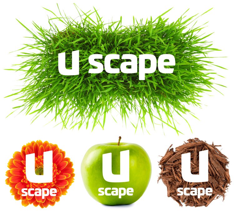
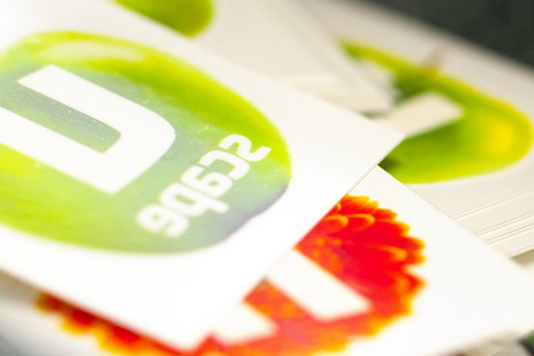
From here, we began to craft the custom typography that makes up the brand mark. This was developed to have flexibility across a very specific colour palette that ranged from an industrial orange, to a softer green and a sleek charcoal to suit U scape’s many different product lines. The U was customised with a soft edge that then became harder as it curved around, helping to underpin their huge offering and take the shape of a shovel edge.
Fresh, engaging corporate style elements were selected that created a fun atmosphere and would help consumers identify indicative shapes and colours relating to each individual product line. For example, a colourful pink gerbera signified plants, flowers and gift ware, and a pile of soil signified their range of mulches and garden products. The aim was for these to be used across the advertising to separate the product messages and offers.
The Solution
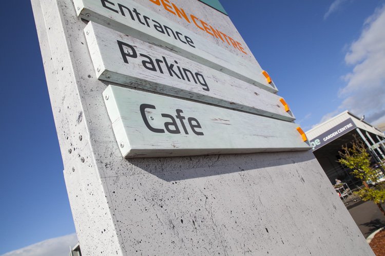
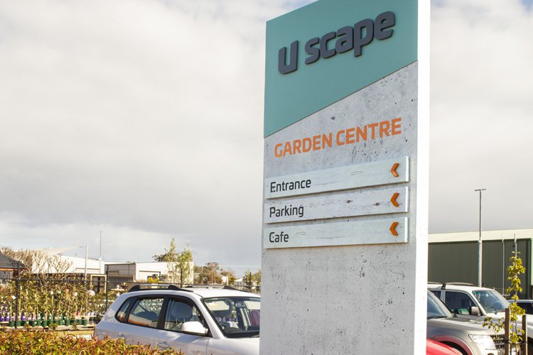
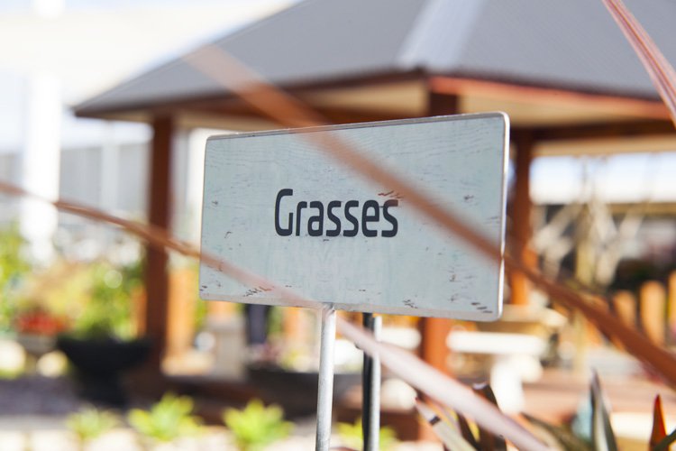
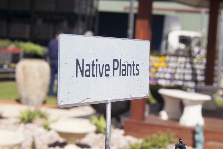
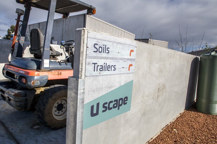
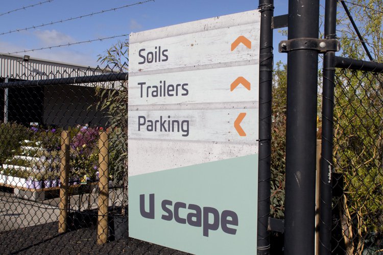
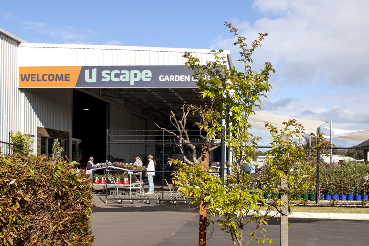
Creating the brand and applying it to the signage was a task we took on with passion. We developed a comprehensive signage plan for the massive space to create consistency and establish the feeling of being in more than just your average garden centre.
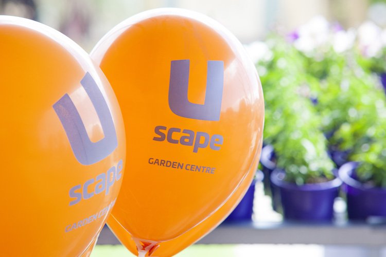
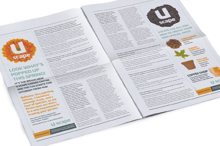
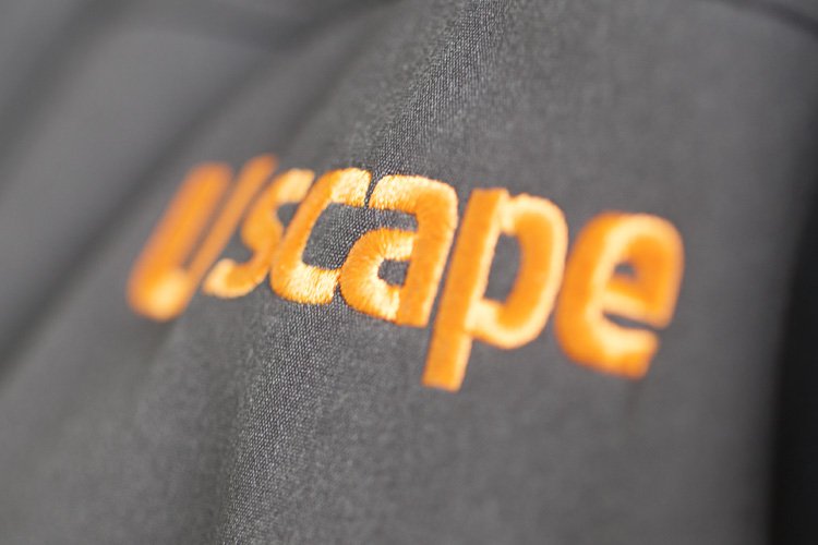
A launch press campaign and a television commercial were developed for the two weeks leading up to the Grand Opening. Balloons, temporary tattoos and branded terracotta pots were produced for the opening weekend. U scape personnel had classic grey uniforms which were embroidered with the U scape logo to show professionalism and trust when engaging with this new business.
The Last Word
Walking into U scape today, you wouldn’t think this was a family business. It has all the marks of a truly amazing experience that offers something for everyone and is positioned in such a way that they can certainly expand in the future, growing the business upon the strong name and brand that was created.
What We’ve Done
- Campaign Development
- Name Creation
- Brand Development
- Corporate Style
- Design
- Printing
- Merchandise
- Collateral
- Signage Solutions
- Photography
- Video Production
- Animation
- Television
- Press
- Digital & Social Media
- Media Planning & Buying
- Copywriting
- Website