
The Challenge
Having conducted work for the City since 2008, thebox has enjoyed working on a variety of projects over the last 2 decades.
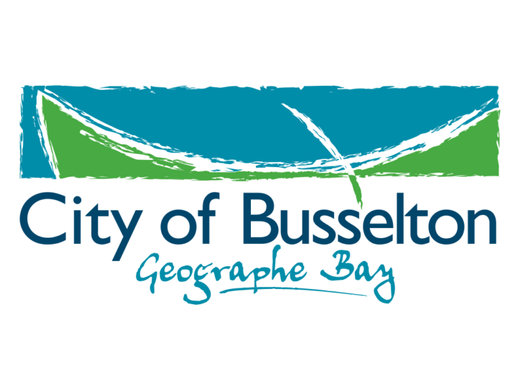
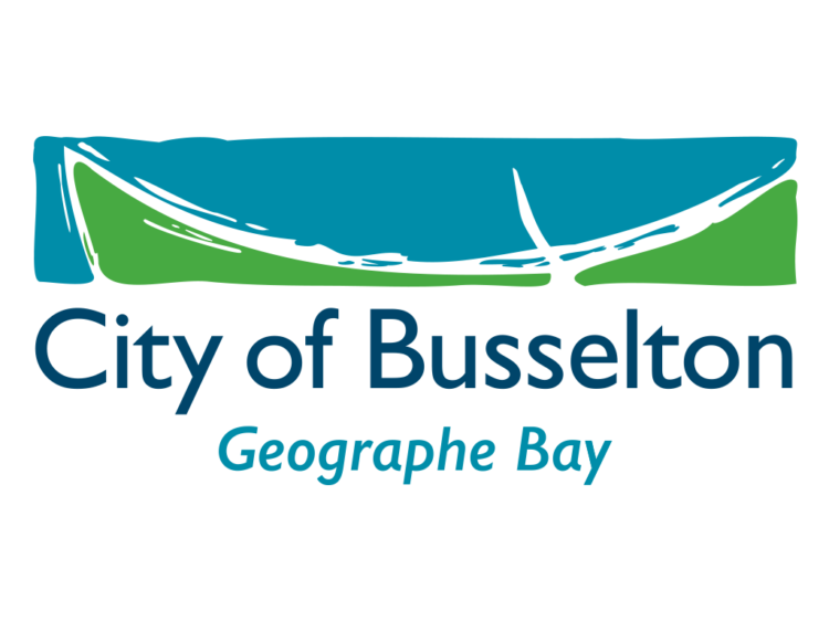
In 2020, City of Busselton requested thebox to undertake a small tweak to the brandmark. It had to be extremely subtle…so much so that most people wouldn’t even notice…
The Idea
For us, this was our opportunity to craft a number of areas within the brandmark which had caught our eye for several years.
These all needed to be done very carefully and in a way which would not draw attention to the change.
The Solution
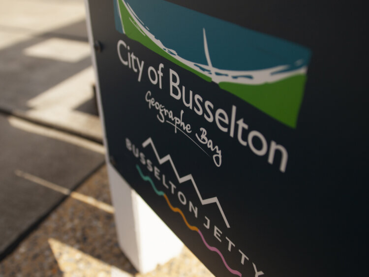
The first place we started was the typography. While the original typography had been well crafted, the shift from Shire to City had resulted in an unusual letter spacing which was disturbing to the eye.
The next was the fact that since its inception, the jetty had been facing the wrong way, bending to the left rather than its actual curvature to the right.
In addition to these changes, we also had to simplify the jagged nature of the brandmark but still retain an element of this so as not to completely smooth it out.
While this all seems fairly simple, the process was painstaking and required a lot of crafting through the process.
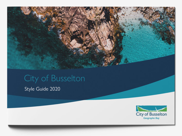
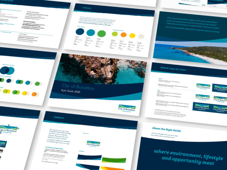
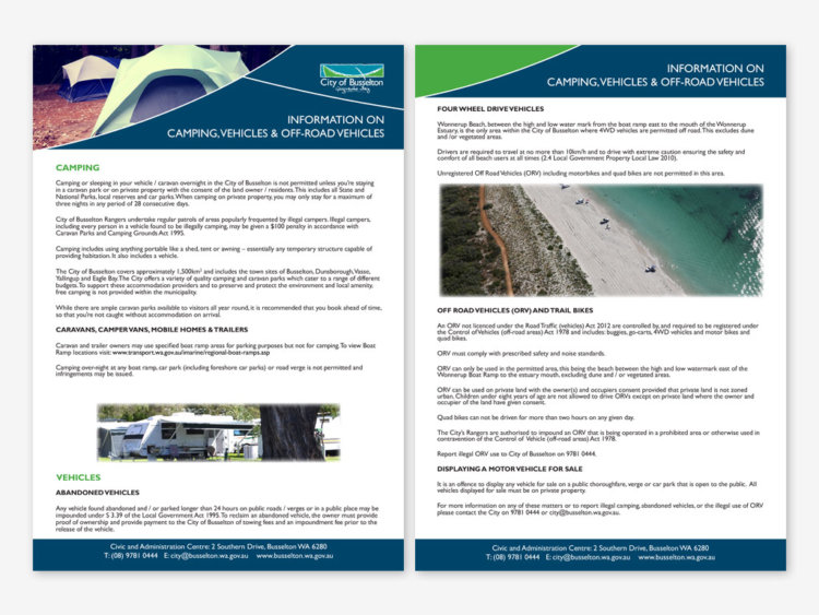
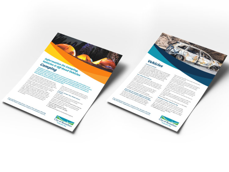
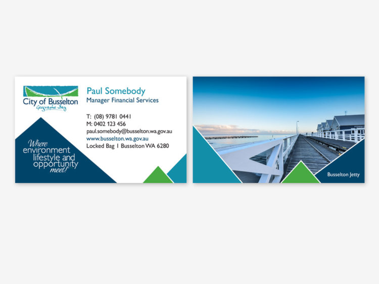
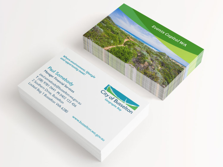
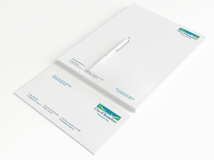
A style guide was also created to assist in executing a new Corporate Style which was created and adopted at the same time, introducing sweeping curves and some additional dynamic colours to allow the marketing team some further freedom outside the bounds of blue and green.
The Last Word
Although this is far from the only work we’ve created for the City of Busselton, we felt it was one that deserved to be highlighted as a case study due to the crafting involved and the challenge of ‘change without change’
What We’ve Done
- Brand Development
- Corporate Style