
The Challenge
Personal concierge company ‘Simply Easier’ approached thebox with the desire to move forward in providing business support, concierge services and lifestyle change services to businesses and the public. We identified the company strengths and measured their ability to be successful in a new aged ‘techno’ world.
The Idea
thebox determined that the best course of action was to begin the task by auditing the brand and with the owner’s approval, we commenced a forensic analysis of the brand’s strengths and weaknesses. thebox focused on the company’s ability to create solutions to a myriad of problems, rather than concentrating on the problems themselves. After much consideration thebox recommended the name ‘ne:Solutions’ which could be audibly perceived as ‘ANY SOLUTIONS’.
The Solution
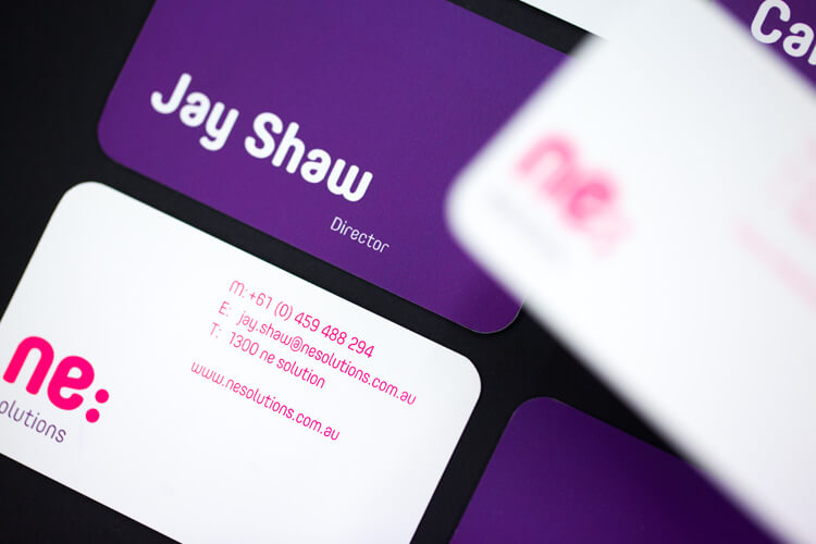
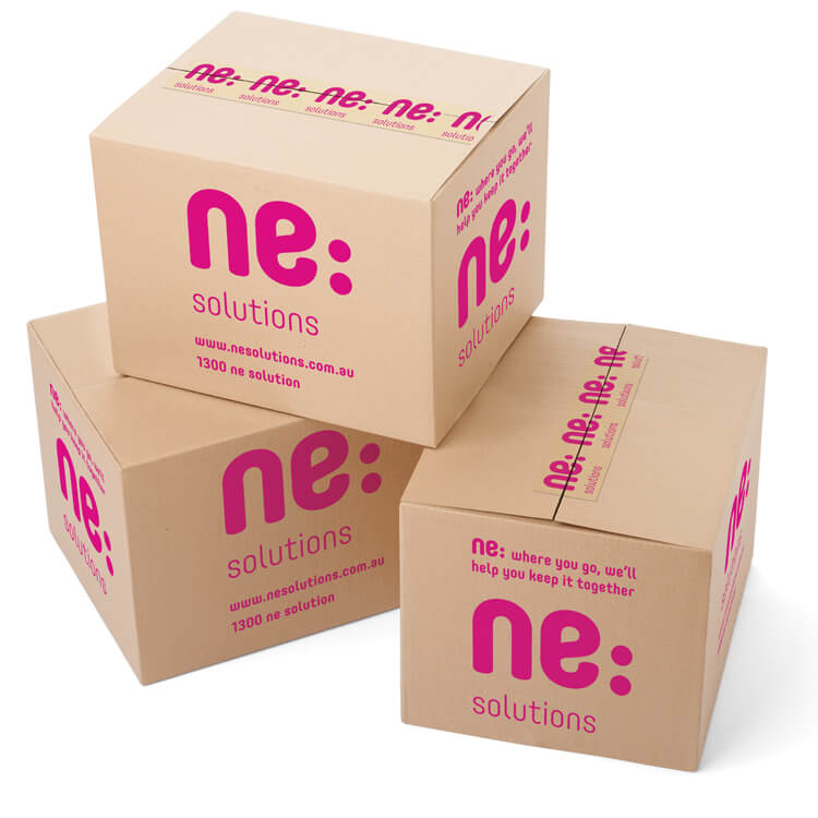
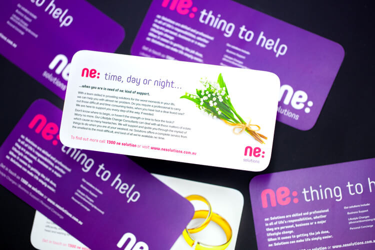
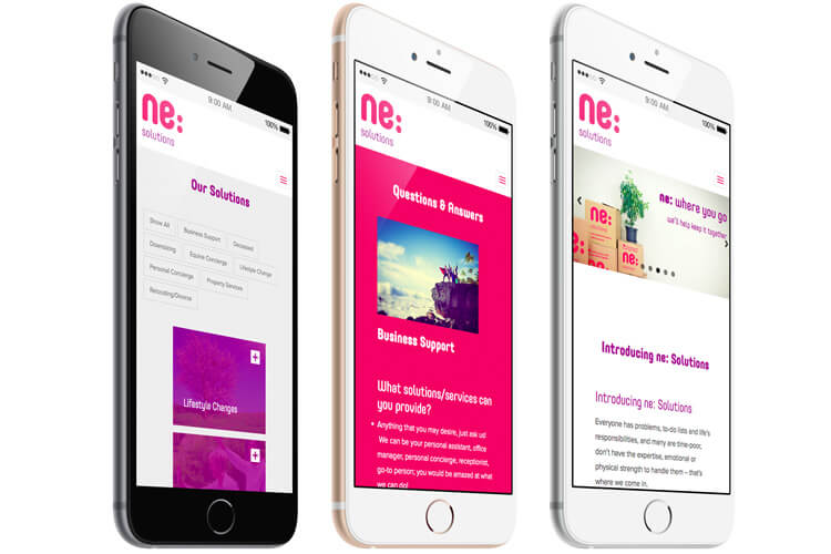
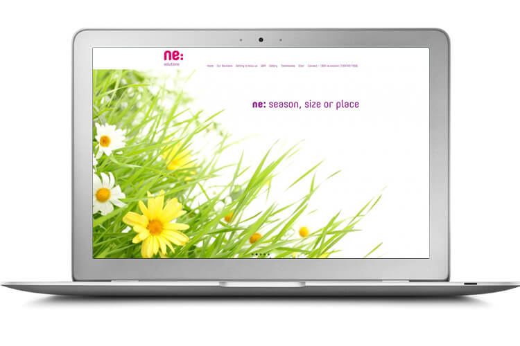
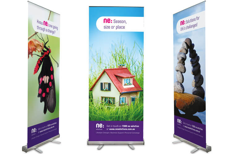
It was important that ne:Solutions public projection was developed to attract a broad audience and that a level of understanding be created and directed at its function. The brand was designed in striking magenta and purple and utilised a bold type style. A website representing the corporate style was created featuring content explaining the work through case studies and featuring photography depicting outcomes. Pull up banners to take to exhibitions were created to generate personal interaction at an audience level. DL cards supported this strategy, featuring further explanation of each solution – Business Support, Lifestyle Change & Personal Concierge. In addition, ne:Solutions branded packing boxes and tape were produced for the house moving sector of the business.
The Last Word
ne: Solutions now have the ability to communicate their function via marketing collateral and a website which contains invaluable case studies for potential clients. Their branding as a whole says they can do anything…and they can.
What We’ve Done
- Strategic Planning
- Name Creation
- Brand Development
- Corporate Style
- Stationery Suite
- Design
- Printing
- Merchandise
- Collateral
- Packaging
- Signage Solutions
- Copywriting
- eNewsletter
- Website
What They Said
When we decided to rebrand and separate our Solutions, I knew there was only one place I wanted to go to. Jack in the Box had previously worked with a client of ours and I liked what I saw. So after an initial discussion with Scott, I immediately felt that our rebranding was in safe hands.
To come up with ne:Solutions seemed, in retrospect, so simple but the work they put into the research and the analysis of what we wanted to do, came through in the presentation of the reasoning behind the name and brand.
When Scott, Tony and Vaughan presented the brand – I actually cried tears of happiness and I suppose relief. Then promptly asked three men of varying ages and all within our target market, would they truly go to a business that was bright fuchsia? Everything from the name and the energy in the colours, ‘the box’ had truly captured what I knew our business to be all about.
Since launching on 31st October 2014, we have had so many comments on the name (the fact they have to say it three times before the penny drops is a great opener) and compliments on the boldness of the business cards, to the energy in our exhibition material. People don’t forget us that easily….and because what we do is quite unique, it is perfect and just how we like it.
I highly recommend Scott and the team of Jack in the Box to everyone who is looking for that unique flair and complete understanding of their business.
Jay Shaw, Director