

The Challenge
The Craft Beer space is an ever increasing category which has become overwhelming for consumers and store owners alike.
Loud and garish design has become the norm and in a sea of craziness, it’s impossible to stand out.
For those more mature in the market, it’s clear that something needed to change and that was the task set for thebox when it came to the redesign of the much loved Tall Timbers range.
The Idea
After feedback from distributors and store owners, it was clear that they loved the beer and the consistency of the designs that were in place BUT…they needed to move to the next level to compete with the growing saturation of the market.
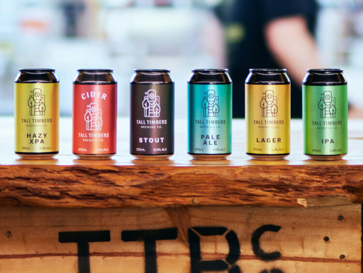
Using the colours that had already been established for each style of brew, we expanded upon this palette and set to work on a bold range of gradients that would act as the backbone to the full suite of crafted brews.
Split into a Core Range and a series of Limited Releases, we wanted to develop a format that would group the cans together but also give them their own identity.
The Solution
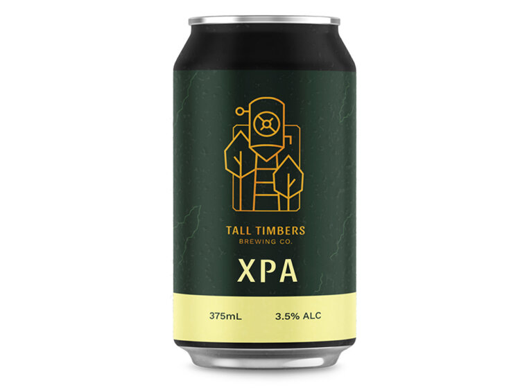
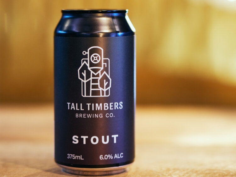
Shelf presence and easy recognition were our key aims for the Core Range and this was achieved through the clean formatting of brand and text combined with the subtle metallic gradients.
The consistent format ensures the buyer knows that they are buying from Tall Timbers but each can is easily distinguished from each other with similar brews being grouped in colour ranges.
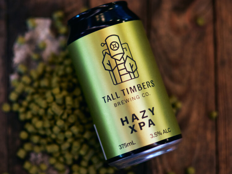
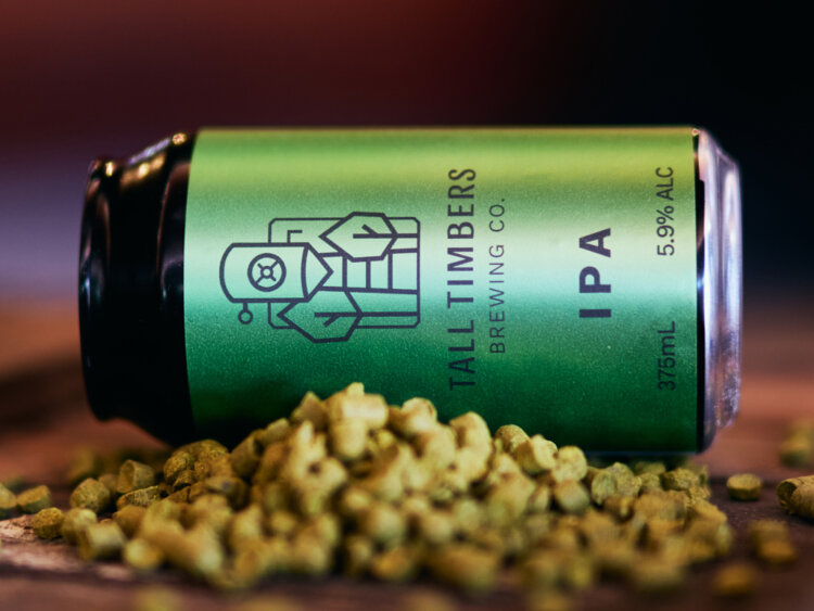
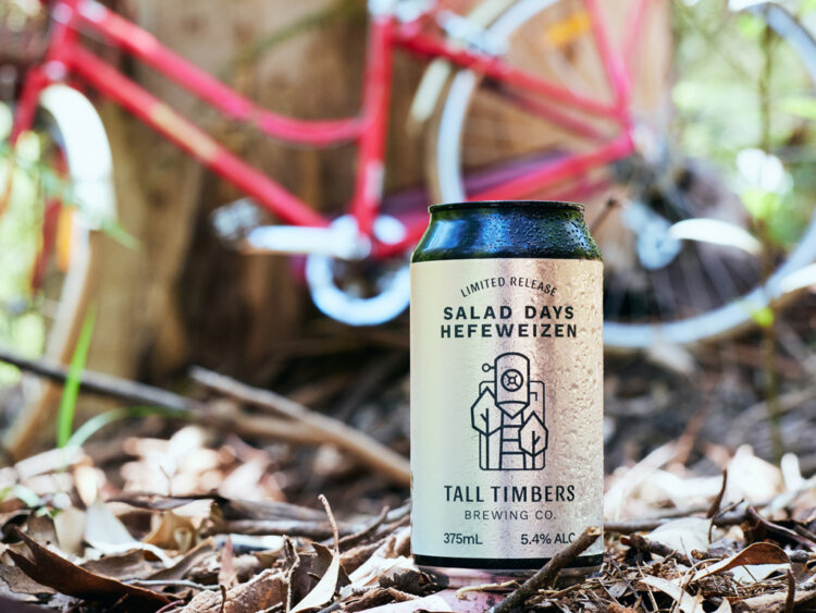
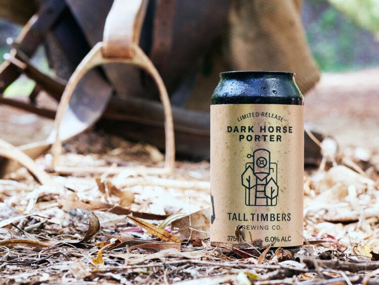
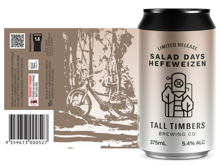
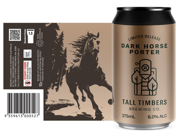
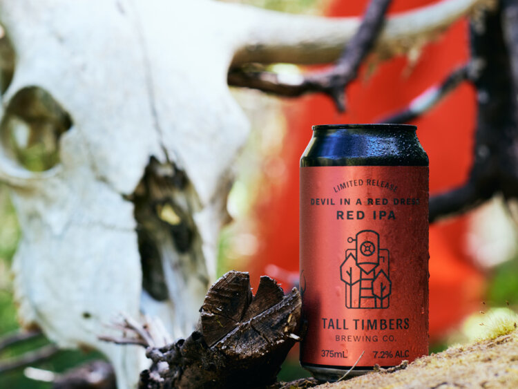
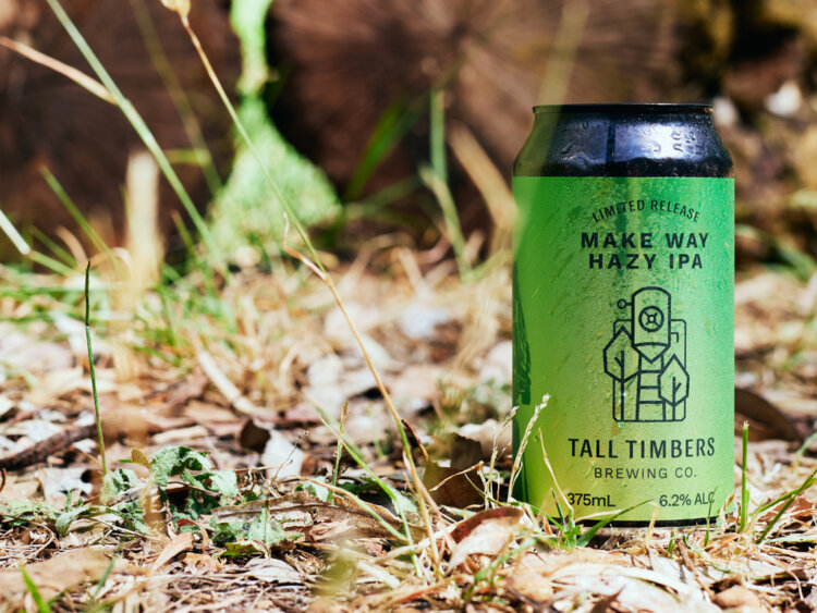
When it came to the Limited Releases, we wanted to employ a custom illustration into the design but needed to find a scalable and cost effective mechanism to achieve a stunning and crafted result. Using a mix of techniques, a suite of highly creative concepts were created to match the name of the Limited Release. Each telling a story and inviting the drinker to dive deeper into what awaits inside the can.
Thematically all set in the forest, amongst the tall timbers, the custom illustrations use a 2 tone colour technique to provide a contrast against the core colour of the can. The textured finish of the label also provides a unique feel under hand.
Backing all of this was a number of promotional components to amplify the new design. This began with 3D renders of all the cans for the Website, ensuring a level of consistency as well as being able to PreRelease any of the Limited Releases prior to having the labels printed.
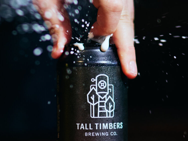
Additional renders were completed with a ‘wet look’ for promotion on the header of the store page.
Further use of 3D rendering was employed to develop a suite of animations of each of the Core Range, providing a sneak peak of the cans and a final reveal.
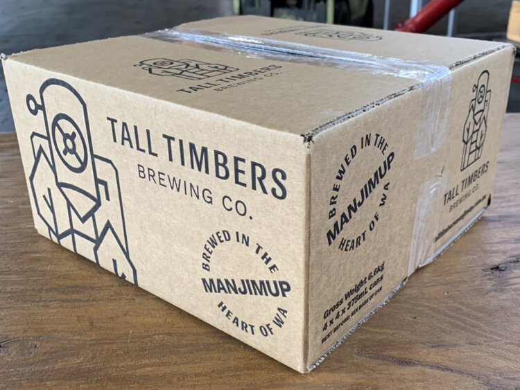
Branded cartons were also produced to assist in carrying the new design along with the ‘Brewed in the heart of WA’ mark, further emphasising the heritage of the brewery and its makers.
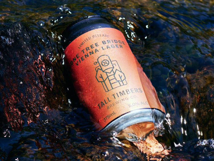
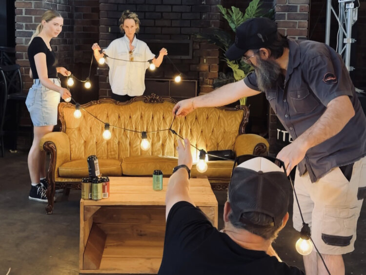
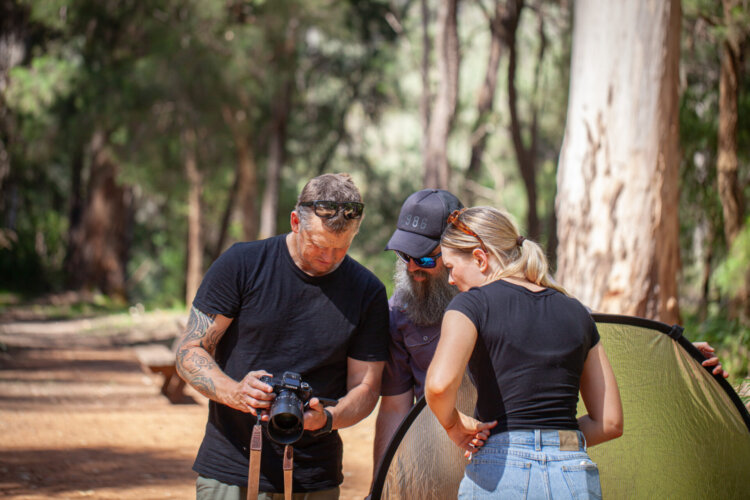
Finally we embarked on a full day photoshoot at the Tall Timbers Brewery in Manjimup and the depths of the Southern Forests region. The Core Range was shot throughout the brewery in a range of creative situations.
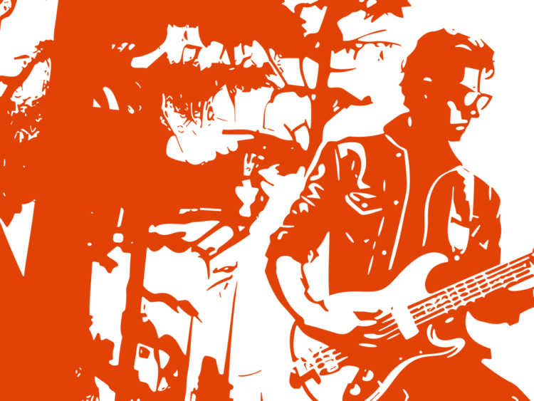
The Limited Release was all shot in the forest and included props which were inspired by the illustrations on the cans themselves.
The Last Word
For many, it’s just a label on a can, sitting on a shelf in a Bottle Shop. But what goes into the making of that label is so much more.
From the crafting of the brew itself to the crafting of each of the design elements, this project was a collective effort which has produced not only a standout collection of craft beer labels, but a system for future releases that ensures a high level of continuity with boundless space for creativity.,
We can’t wait to see what will be brewed next…
What We’ve Done
- Concept Development
- Strategic Planning
- Facilitation
- Brand Development
- Corporate Style
- Design
- Collateral
- Packaging
- Photography
- AI Generation
- Animation
- Digital & Social Media
- Copywriting
- Website
- Project Management