
The Challenge
When you’re approached by a long term client and successful business family with a tradition and a history exemplified by a long standing imprimatur, developing a meaningful brand mark requires a special approach.
Beginning a new and exciting chapter in the families business, the Vukelic Family required a refreshed and modernised portrayal of a highly traditional family crest. Its antecedents vested in European history and more lately here in the state of WA, the historically beautiful representation provided a unique challenge. How would we represent this new and dynamic family business while still paying homage to the tradition of its heritage?
Treading carefully in the full knowledge that this was more than an organisation but a family, we began our task with an understanding laced by sensitivity and punctuated with a priority to represent the human side of the design equation.
The Idea
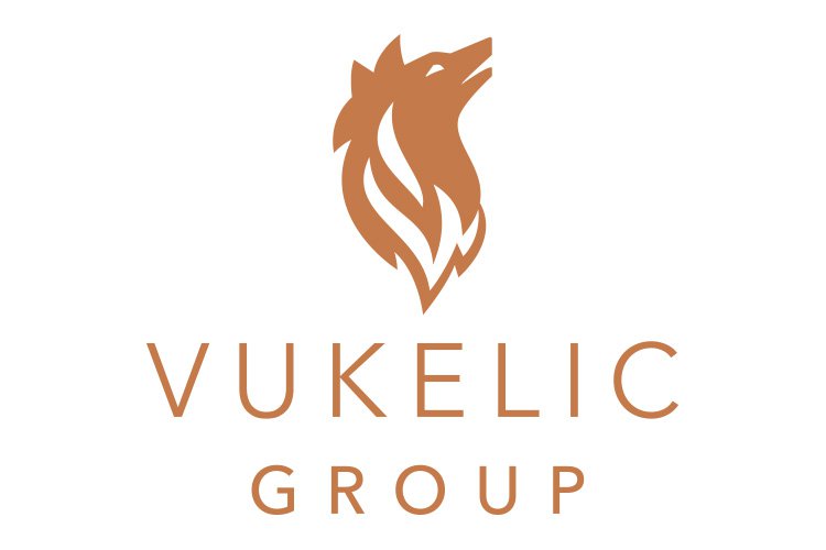
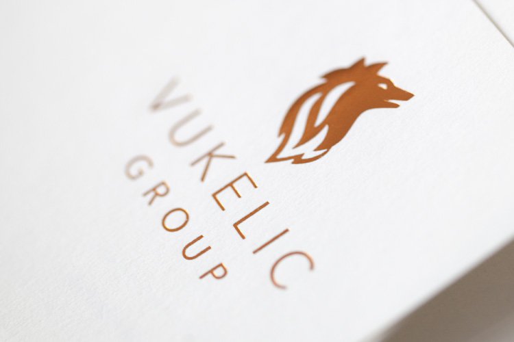
Our first task was to view the existing coat of arms to identify the icons and understand what they meant. A number of options were obvious but one in particular demanded our attention – that of a wolf. This became a key driver for our work. We also noted that a wolf stands strong & proud with a puffed out chest, alert ears, looking forward.
The Solution
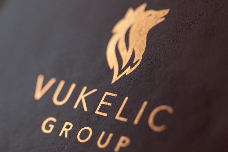
The design team then took the concept and created a unique brand mark that is a modern iconic representation of a proud wolf. Non aggressive, yet dignified, crafted and stylised to its minimal form, creating a mark that allows clear and strong visual communication. The line quality of the mark is used to achieve form and shape, and importantly allows for various print techniques such as foil stamping, embossing or Spot UV Print, adding a prestige positioning.
The typography is clean and classic with a sense of refinement. The colour palette has been reduced to create a contemporary feel, while copper metallic has been selected which is representative of the tones within a wolf’s coat (particularly the Eurasian wolf). Rich, deep chocolate has been used as a base colour along with a gun metal grey as a support, both representative of a wolf’s colouring.
The Last Word
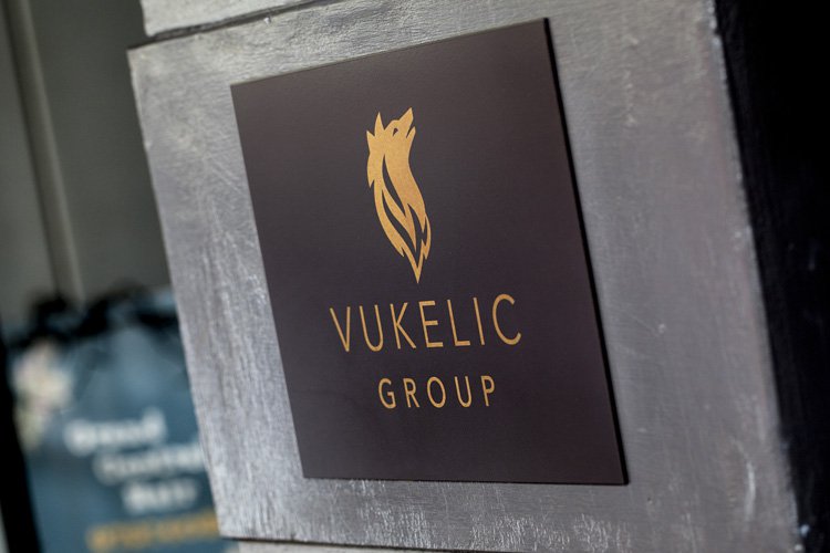
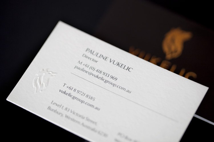
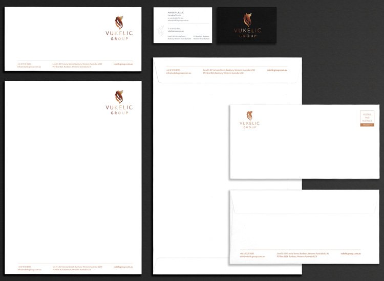
The branding was completed with a full set of stationery and sign applications including:
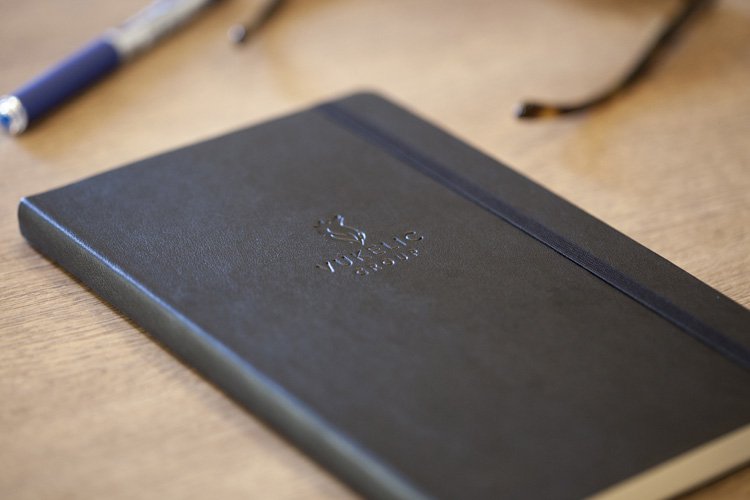
Business cards, letterheads, with compliment slips, envelopes, report covers and prestige note books. Each used a range of techniques to achieve a quality finish including embossing and foiling. Signage was carefully created to support the prestige of the family icon. To the complete delight of the family members, the new branding is now a key part of the Vukelic Group’s communication strategy.
What We’ve Done
- Brand Development
- Corporate Style
- Stationery Suite
- Design
- Printing
- Signage Solutions
- Website