The Challenge
The Arc of Iris was one of Margaret River’s most iconic restaurants. Especially famous for its prized ‘duck dish’ it was purchased by new management in 2014. thebox was approached to develop a rebrand which would maintain the eatery’s iconic standing and sustaining its eclectic feel, while refreshing its awareness in the mind of the consumer
The Idea
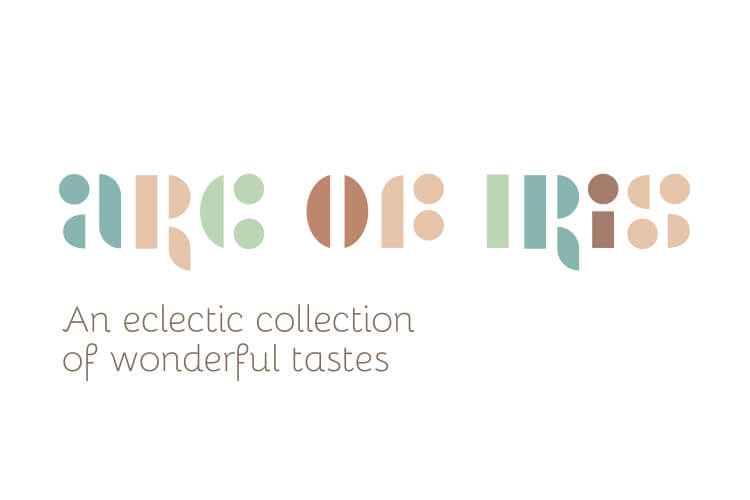
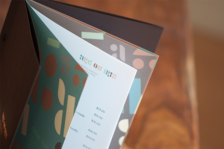
The vision was to create a brand on which the eye could observe different objects which matched the variety of foods offered; a brand positioning which stimulated the senses. The idea was to utilise shapes to demonstrate the eclectic nature of the restaurant itself – an odd technique for an odd dining place. The idea required the use of simple shapes which formed the design elements, using a modern symbolism which depicted the quirky nature of the restaurant’s environment.
The Solution
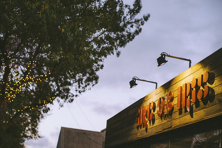
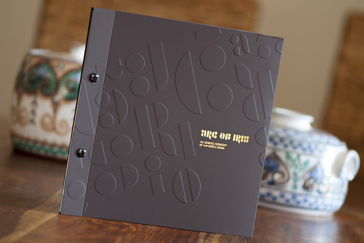
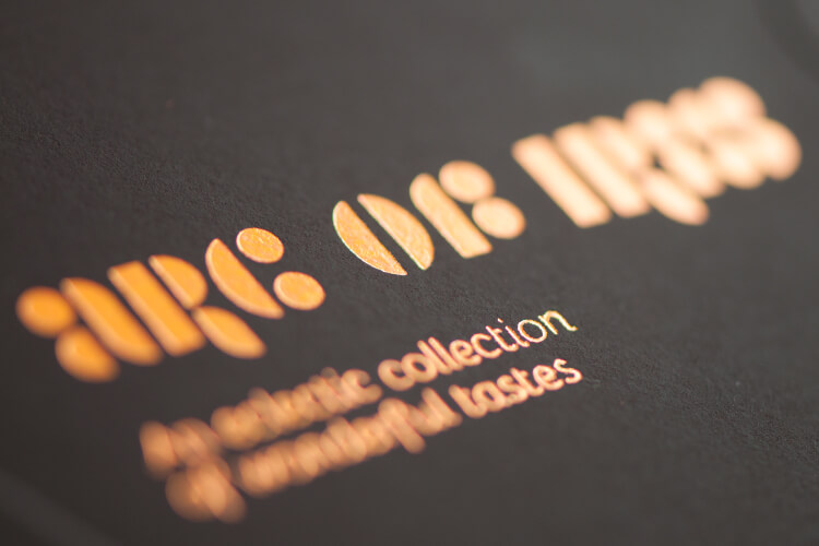
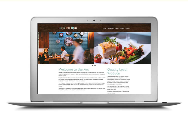
With the interior of the restaurant now moving away from its infamous vivid rainbow and lilac imagery, we needed to introduce a more organic feel. The new brand identity was to work with a more natural colour palette and the custom designed typography’s eclectic nature ensured that the new brand maintained its warmth. New external signage was created on southwest timber and back-lit for added visibility at night. Beautifully embossed menus were designed using stylised lettering in copper foil. Window posters utilising the new branding were designed along with business cards. A new website was also developed to fully engage visitors and create a replica experience prior to entering the restaurant.
The Last Word
The new look and feel of the Arc of iris has been supported by the owner’s commitment to interior renovations. All other design elements have contributed to maintaining the much-loved eclectic nature of the restaurant. Growth has been strong and the restaurant is now licensed and has extended its opening hours due to demand.
What We’ve Done
- Brand Development
- Corporate Style
- Design
- Printing
- Templates
- Signage Solutions
- Photography
- Website
