


The Challenge
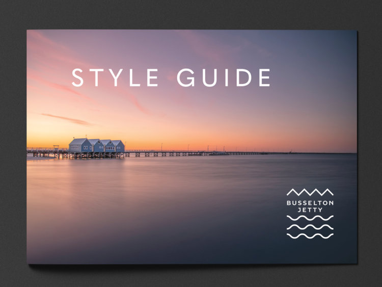
The Busselton Jetty is a bonafide icon. Stretching almost two kilometres out into the crystal blue waters of Geographe Bay, the heritage-listed site is the longest timber-piled jetty in the Southern Hemisphere.
With a new national flight path between Busselton and Melbourne, the team behind Busselton Jetty wanted to capitalise on the influx of travellers that would be arriving. They approached thebox to create a brand as outstanding as the landmark itself, as well as a sub-brand for the Jetty’s own waters-edge restaurant, the Blue Mile Busselton.
The brand needed to appeal to the visitors, as well as maintain integrity and community collaboration from a range of stakeholders including volunteers, board members and community groups.
With a large presence and their existing logo plastered everywhere – from underwater and on timber, to merchandise, uniforms, collateral and promotions – this was going to be a big job.
The Idea
The jetty is an international icon – and it needed a brand that reflected the calibre of the structure and its legacy to the region.
Between the bold, bright colours of the natural surroundings and marine life to the iconic Busselton hut shapes and piers, thebox had some great raw materials at hand to pitch a brand that did justice to the jetty’s stunning landscape.
Finding the perfect balance between the organisation’s key drivers of tourism, marine science and community outcomes would underpin all strategic brand planning.
The Solution
As we’ve been known to do, thebox took Busselton Jetty’s idea to rebrand and ran with it.
We were bold with our ideas: a beautiful historical attraction with a thriving visitorship, we believe the jetty deserves to be idolised alongside other man-made landmarks, like the Sydney Opera House or the London Tower. Truly iconic landmarks that are synonymous with its region.
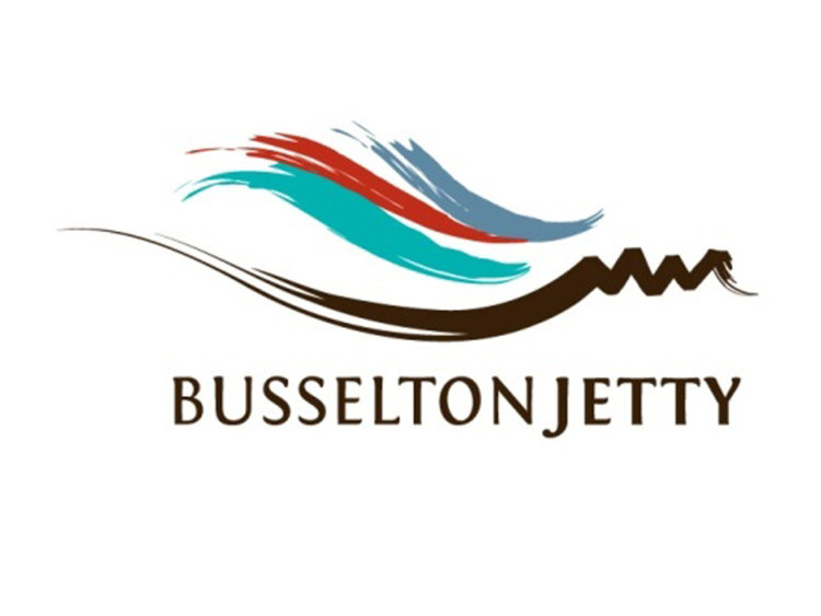
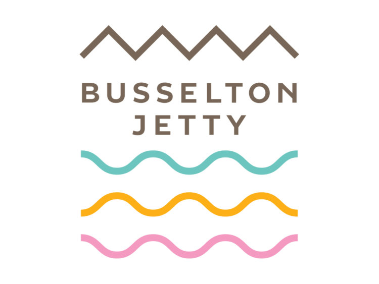
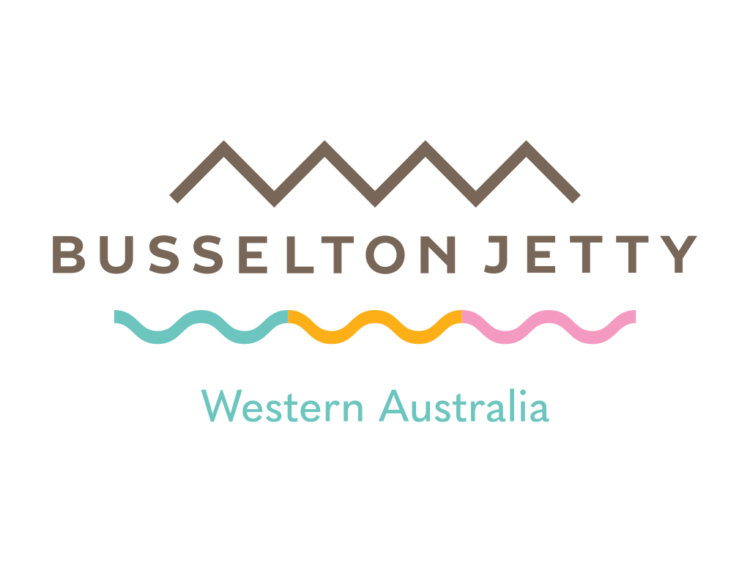
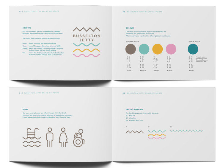
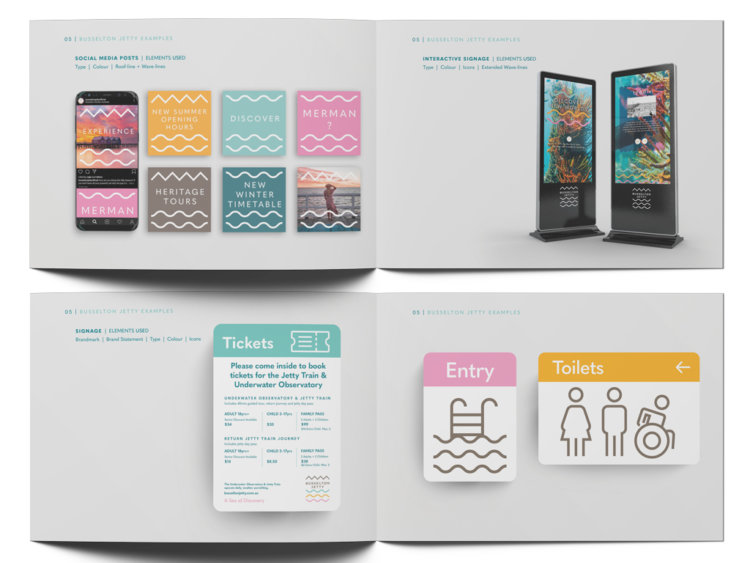
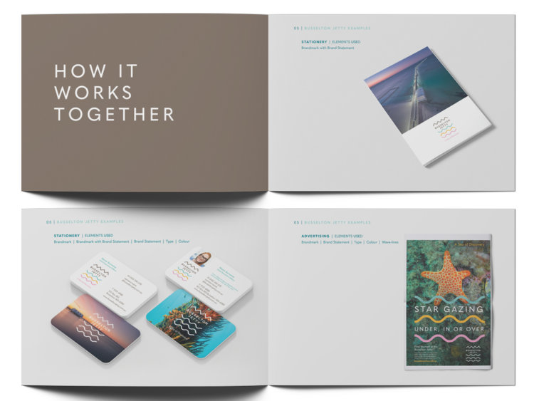
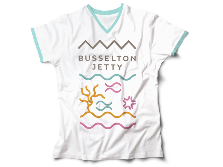
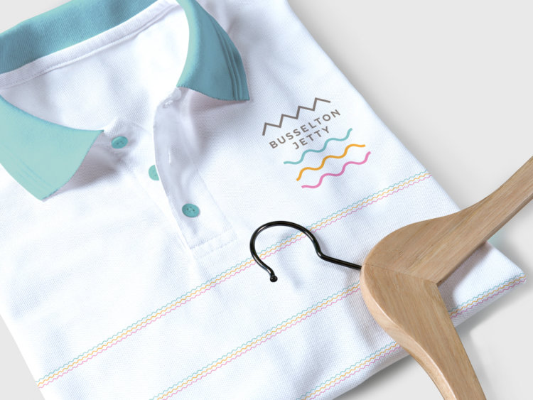
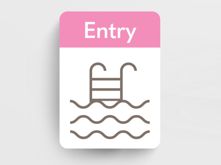
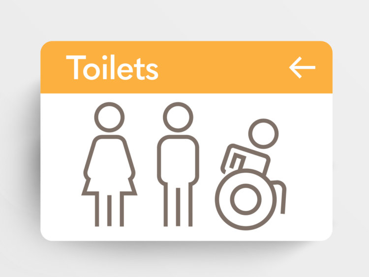
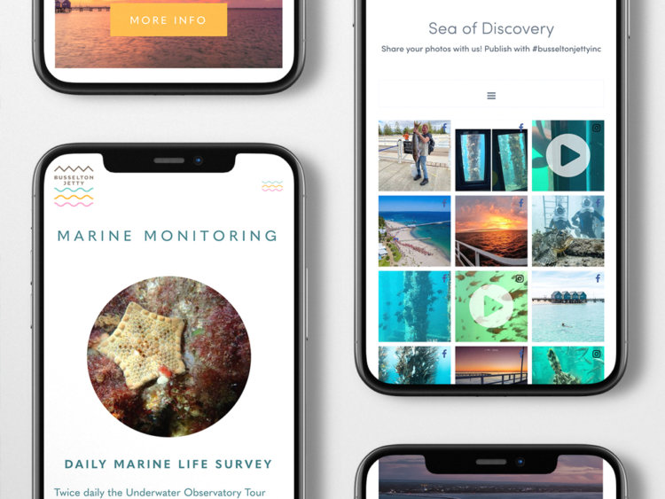
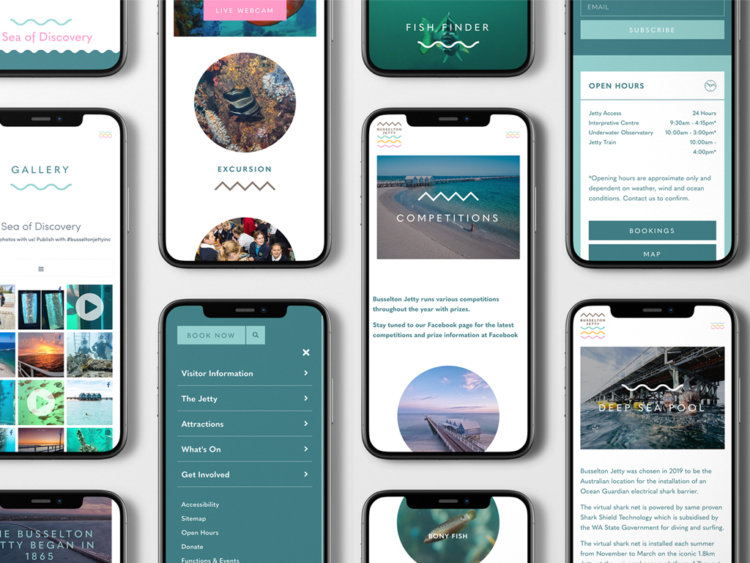
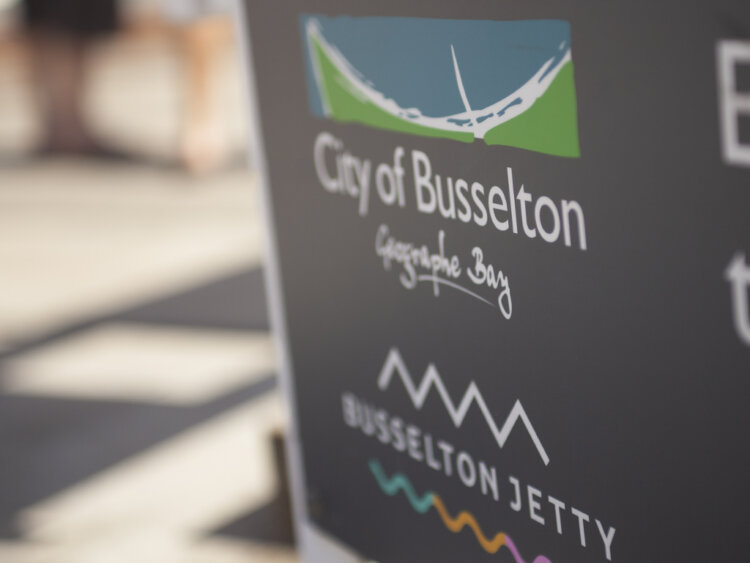
We developed a brand that was icon-based. Refreshed from the existing logo, we created a brandmark that spotlighted the iconic structure and the greater region’s surrounds: the warm brown of the timber, sparkling turquoise Geographe Bay, and bright pinks and oranges reminiscent of local marine life. The result is a brandmark that feels alive – like a bustling boardwalk, or shoals of vibrantly-coloured fish.
Importantly, the brandmark is clean and modern and seamlessly works across both tourism and scientific applications.
The Last Word
Even a rebrand wasn’t immune to the global pandemic. With COVID delaying (and then delaying again, and again) the launch of the new flight path and the subsequent brand rollout, our work with Busselton Jetty has been truly collaborative and ongoing.
While having to be agile, thebox delivered a huge body of work working with important stakeholders to retain the Jetty’s historical, cultural and emotional significance to the local community and beyond.
The Award
thebox were awarded a BRONZE Summit Creative 2022 International Award for the Busselton Jetty Website. The Summit Creative Awards recognise organisations internationally who excel in marketing initiatives.
What we’ve done
- Strategic Planning
- Facilitation
- Brand Development
- Corporate Style
- Stationery Suite
- Design
- Collateral
- Templates
- Signage Solutions
- Website
What They Said
“Working with the thebox crew has been an eye-opening and rewarding experience. Not only have they taken the time to understand the uniqueness of our business, their responsiveness and can-do attitude has been so refreshing, even in the most challenging of environments, demands and timeframes. Following the website launch, we have had nothing but positive feedback and we look forward to continuing to working with the team on future opportunities as our business grows.”
– Sarah Hijazi, Project Manager