
The Challenge
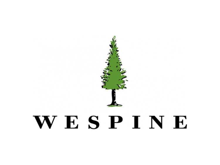
When Wespine first approached us in 2018, the brand was tired and out of date. In desperate need of a rebrand and a way to connect with an evolving audience focused on a sustainable building product, thebox were commissioned to develop a fresh new brandmark that would leverage from the existing mark through an evolution.
Critically, the brand needed to translate across a variety of audiences including corporate, retail and community.
The Idea
Evolving an established brand is no mean feat. It requires a careful balance of extracting the value from the current brand and injecting new and fresh thinking. Wespine is the epitome of a well crafted brand evolution.
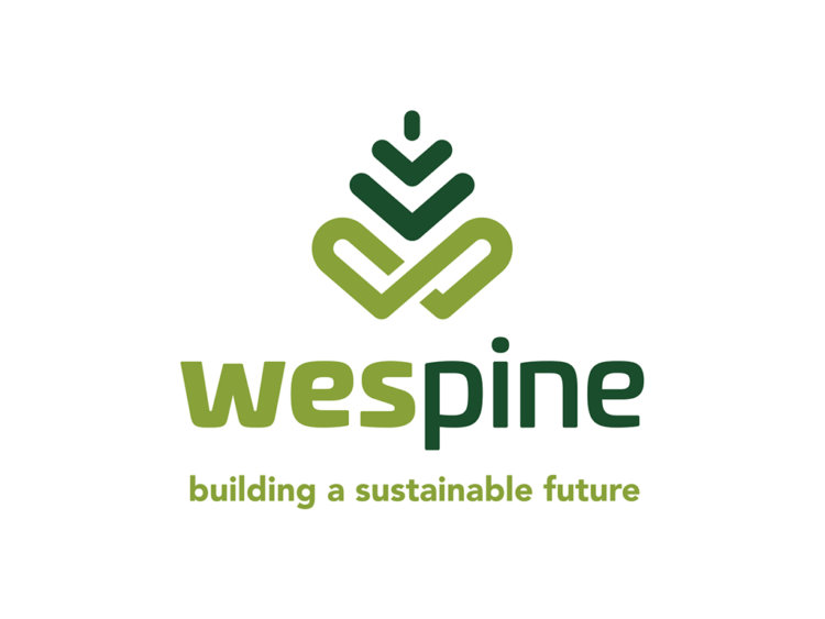
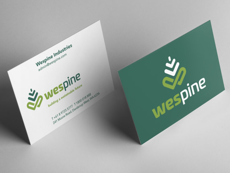
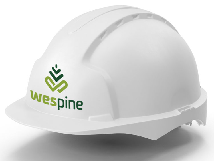
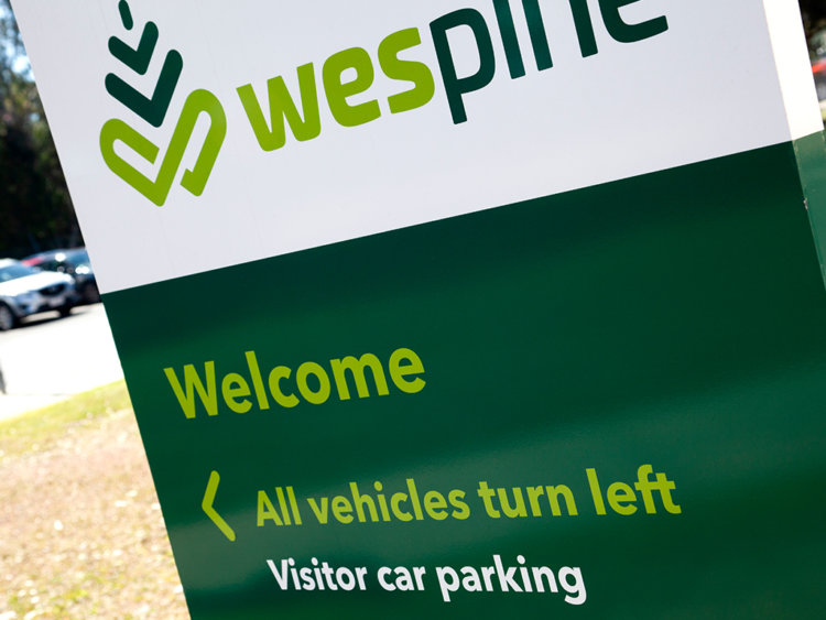
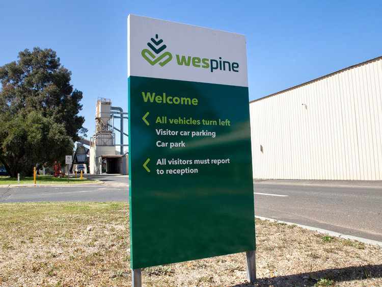
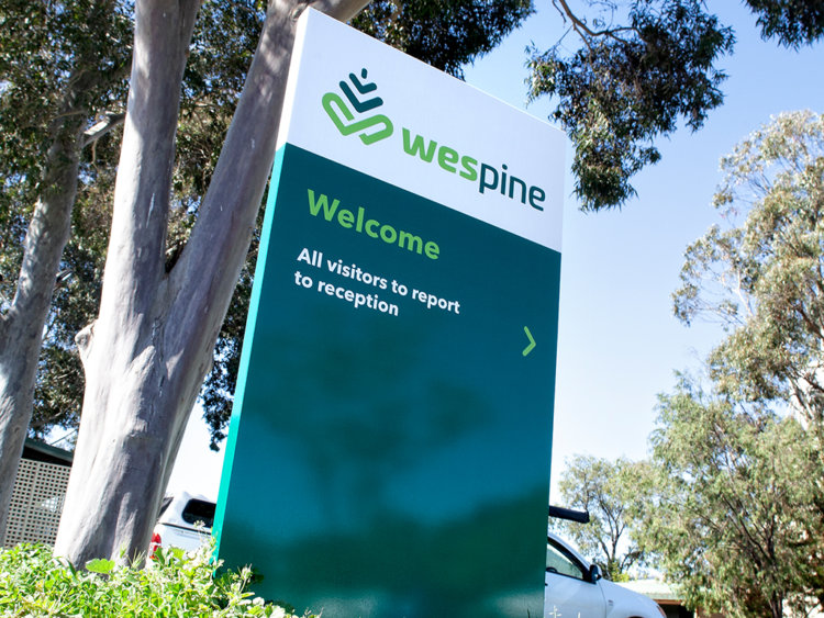
With subtle colour tweaks and a modern take on the pine tree graphic, we developed a new brand and feel for Wespine which could be easily translated across any medium.
The Solution
Hidden within the new mark is an infinity symbol, representing the renewable nature of the product. While arrows subtly point towards the infinity symbol to further reinforce the point.
The two colour typography also assisted in solving another issue which was that of people referring to the company as WEST PINE.
The Last Word
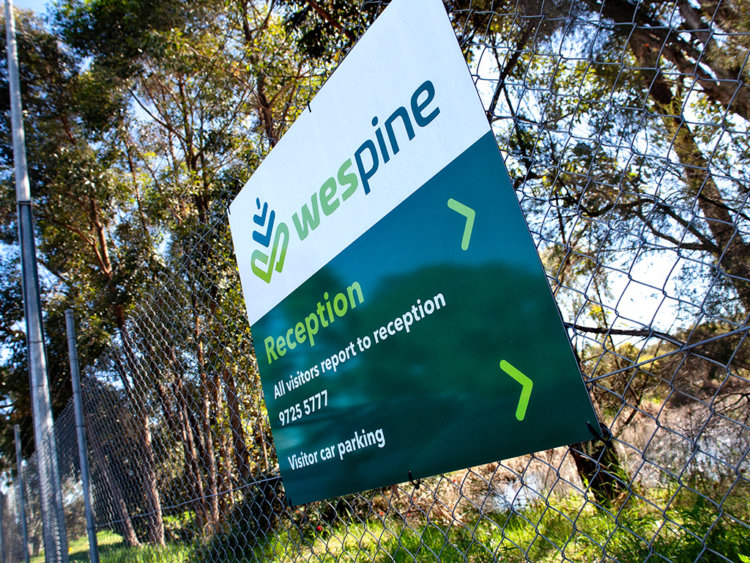
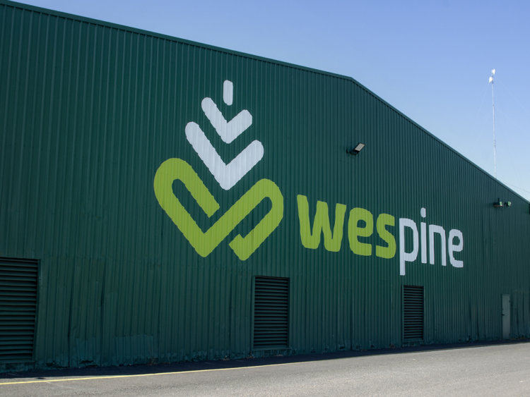
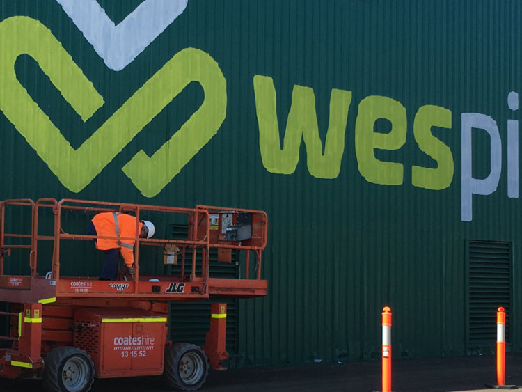
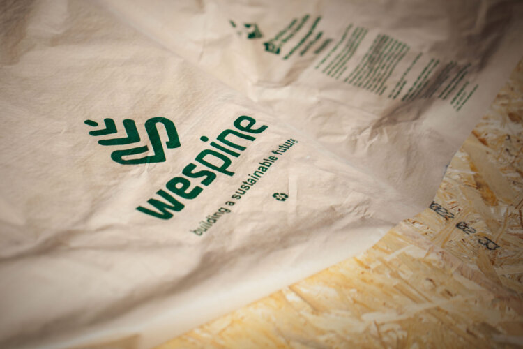
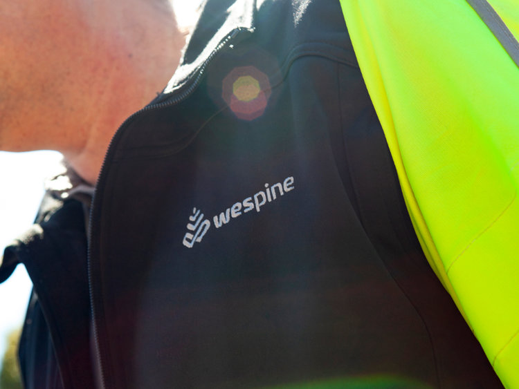
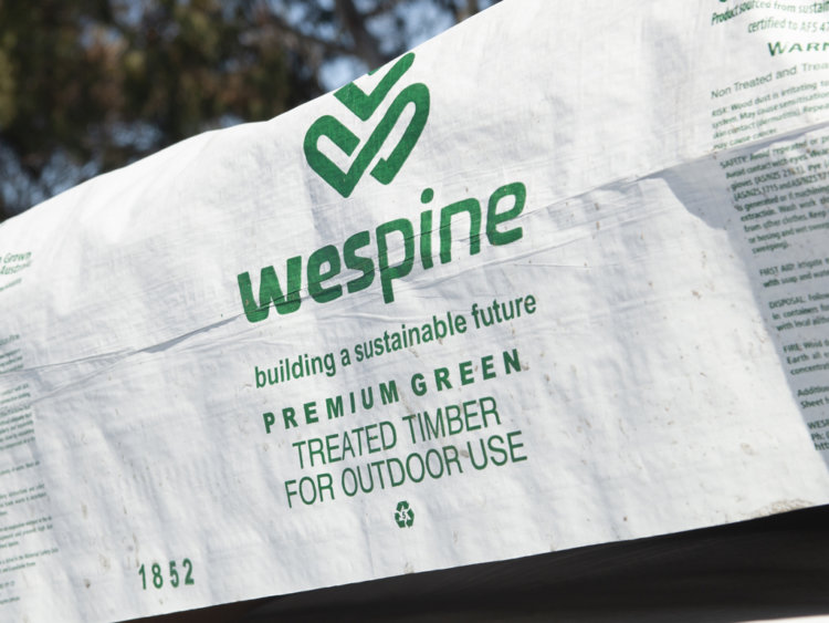
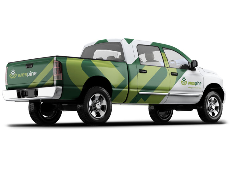
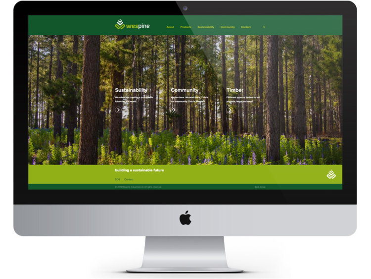
Over the years, we’ve continued to assist Wespine with a variety of executions from website through to signage. The brand even adorns each stick of timber manufactured by Wespine.
In 2018, thebox was awarded a SILVER international creative award for the brandmark.
The Award
thebox were awarded a SILVER Summit Creative 2018 International Award for the Wespine Rebrand. The Summit Creative Awards recognise organisations internationally who excel in marketing initiatives.
What we’ve done
- Brand Development
- Corporate Style
- Stationery Suite
- Design
- Printing
- Merchandise
- Collateral
- Packaging
- Templates
- Signage Solutions
- Animation
- Photography
- eNewsletter
- Website