

Lowdown
We began working with Timber Insight in 2020 when Ian came to us to craft a refreshed brandmark.
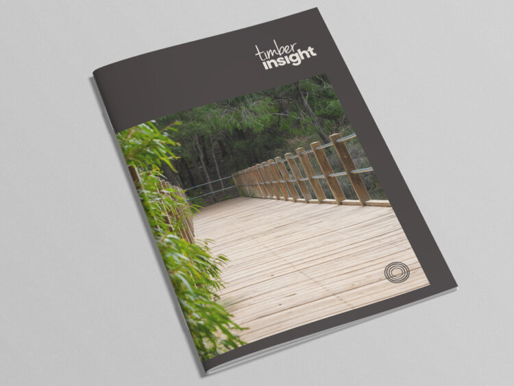
The mark symbolises the rings from a tree, giving the brand texture while the text pays tribute to the original brandmark through a carefully crafted execution.
This simple, natural colour palette and updated vibe provides Timber Insight with a modern take on a brand that has gained presence with its audience.
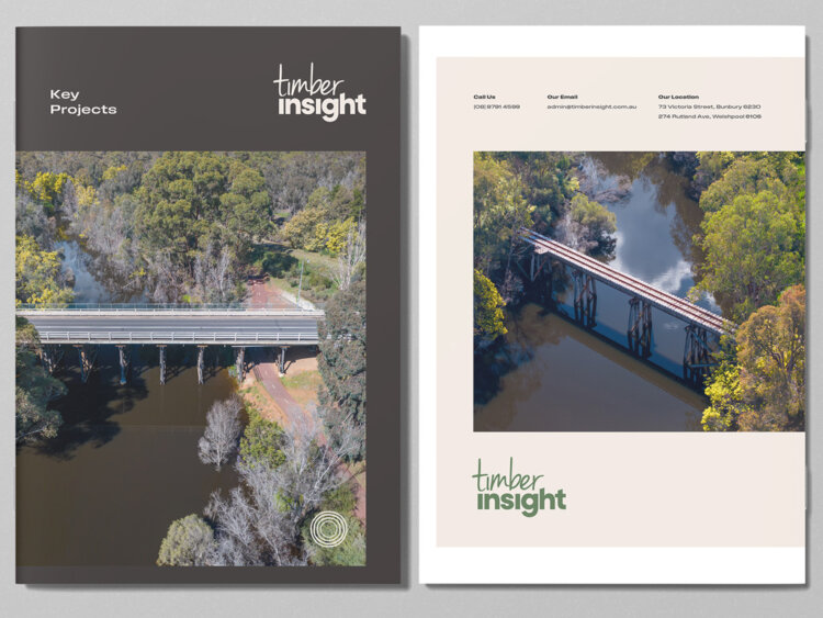
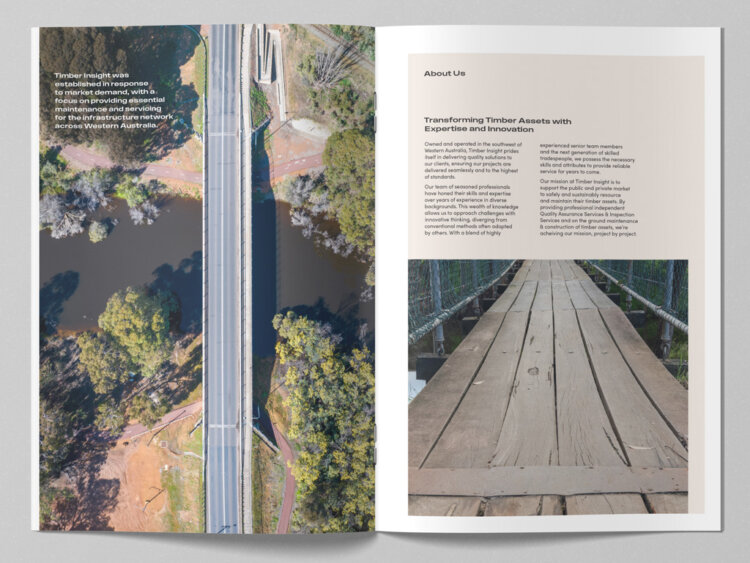
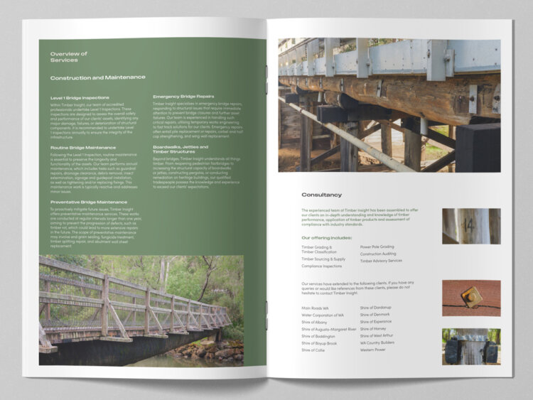
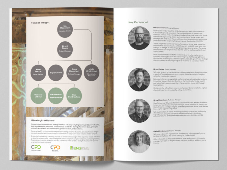
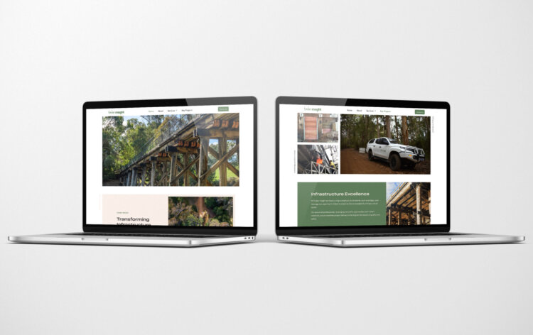
Since crafting the rebrand, we have assisted Timber Insight with a range of executions from a Capability Statement to a simple website.


What We’ve Done
- Brand Development
- Corporate Style
- Stationery Suite
- Design
- Collateral
- Templates
- Copywriting
- Website
What They Said
“thebox’s creativity, attention to detail and customer service is second to none. We continue to be blown away by thebox ‘thinking outside of the box’ and look forward to continuing our relationship long into the future!”
– Brent Rowe, Project Manager