
The Challenge
Having promoted ‘Everything Nannup’ for sometime, the Shire of Nannup made the call to shift its tourism positioning to ‘Experience Nannup’. This formed part of a wider plan around the Nannup Trail Town Project.
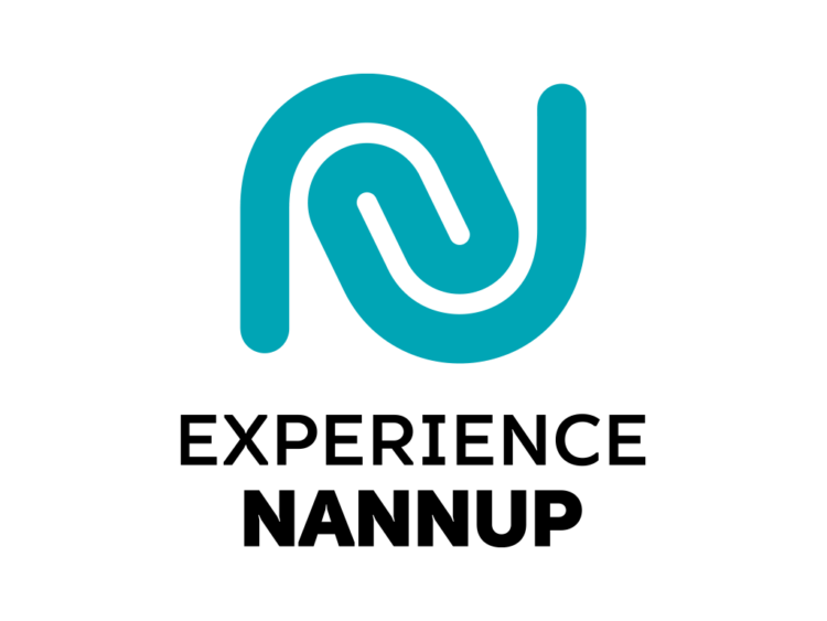
As such, a new brandmark was required to promote the town.
The Idea
Having spent some time in Nannup and engaged in a number of Discovery Sessions across the community, we set about developing a brand which would stand out in the flooded tourism market.
Inspired by the movement of the ‘Goorbilyup’ and meandering trails and switchbacks, we crafted an ‘N’ icon which symbolised the concept of stopping in Nannup. In Noongar language, ‘Nannup’ means ‘stopping place by the water’. And so the icon was born.
The Solution
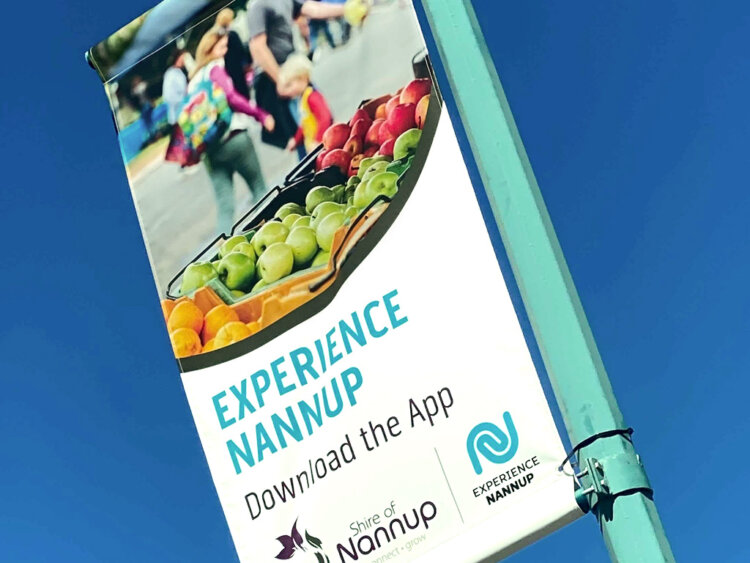
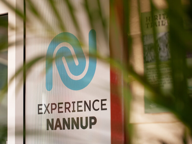
The new mark needed to be executed across an array of collateral including a newly developed tourism app, website, trail maps, signage and street banners.
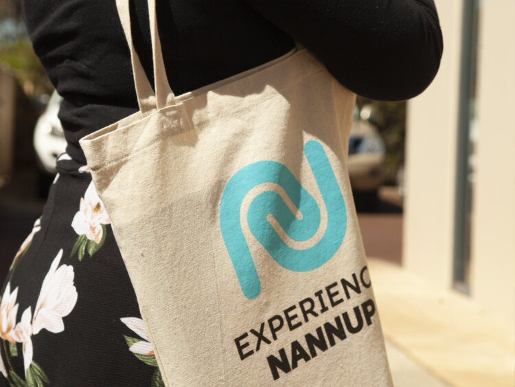
Swag, such as tote bags and USB’s were also created to launch the brand to the community.
The Last Word
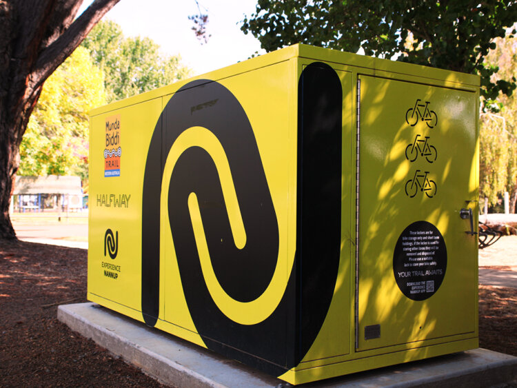
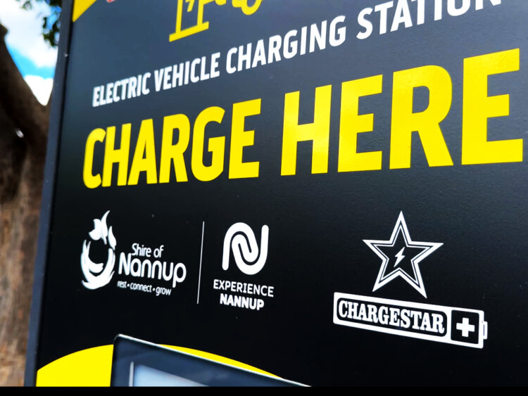
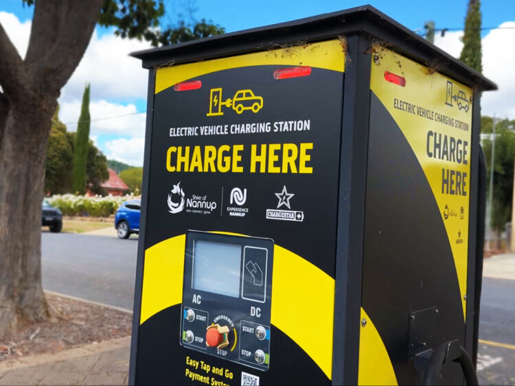
Experience Nannup continues to grow and be executed across an array of applications. The addition of bike lockers and an electric charging station have provided unique applications of the brand also.
What We’ve Done
- Strategic Planning
- Concept Development
- Facilitation
- Brand Development
- Corporate Style
- Design
- Printing
- Merchandise
- Collateral
- Signage Solutions
- Website
- Project Management
What They Said
“During the Shire of Nannup’s tourism strategy transition, thebox provided expertise in brand development and together developed the Experience Nannup brand. Their ability to connect with the community and identify opportunities for collaboration enabled the support. Experience Nannup captures the unique beauty of Nannup, a brand that speaks to the community and something visitors can connect with.“
– Nicole Botica, Economic & Community Development Coordinator