We’ve all witnessed some of Australia’s biggest companies undergo a brand change recently; Woolworths and ANZ are two giants that instantly come to mind. As someone whose daily task is often advising how to implement change, I tend to pay pretty close attention to how these massive overhauls are implemented. Believe it or not, the change process is not that dissimilar, regardless of whether you employ 10 people or 10,000. The only real difference is money, and the degree of national media coverage (which means we can all learn from the big guys’ very public mistakes!)
Explore our historical blog articles for nuggets of wisdom (and random musings) from our crew.
Ah! Now for a sit down… Why would anyone make an ad for a bank with a knitted doll or a plastic flower that talks? Dolls and plastic flowers don’t talk… or do they? Maybe I missed something.
Now which bank was it? (pause) Come on think! What was its name? Crikey you’d think I’d remember, after all it’s a doll and a plastic flower telling me where to bank, maybe the alzheimers is kicking in … nah, can’t remember… it’s escaped me…
In the advertising business there is a common belief that strategists and designers are different animals who should never be left in the same room together. I’m glad to say at Jack in the box we are not so precious. While we respect each others talents, we also encourage ‘crossovers’ because it broadens and sharpens all our skills. More importantly, it gives our clients the benefit of sound thinking which creates greater performance.
Such a mind synergy allows me to feel completely comfortable in discussing my favourite strategic design subject – ‘typography’. I want to look at it from a purely strategic viewpoint and discuss why it matters so much in the communication business.
As brand architects it’s our business to know about brand ownership. You have absolutely no idea how many people believe that once they’ve had a brand designed and paid for it, they own it. If your one of those people I need to very quickly shake you from your complacency.
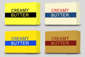
Colour is an important and powerful mechanism, especially when it comes to packaging and branding. It can influence a consumer to buy one product over another or to spend more money on what is essentially the same item. Designers use colour, and colour combinations, to create a personality for a product or brand and affect your perception of it’s value.
What do you think the best attention grabber in advertising is?
I’m sure somewhere along the line people have forgotten their mother’s pearls of wisdom – “Don’t you know it’s rude to stare?” – because that’s all that’s been happening for the last few days as people walk past the Jack in the box front window.


